Design has a funny way of circling back. The styles we thought were left in the past often return with fresh energy, blending nostalgia with modern tools. For designers and illustrators in 2026, vector art is having a major moment of reinvention. The shift away from sterile, AI-generated perfection has opened the door for styles that feel human, tactile, and full of personality. Whether you are working on brand identity, editorial illustrations, or social media assets, knowing which vector art trends 2026 are gaining traction can help your work stand out. Let us look at the five styles making a real comeback this year and how you can use them in your next project.
Vector art in 2026 is moving toward texture, imperfection, and bold storytelling. Hand-drawn accents, raw geometric forms, and retro-futuristic palettes are replacing sterile flat designs. To stay relevant, mix digital precision with organic finishes. Embrace grainy brushes, limited color schemes, and layered compositions that feel crafted, not generated.
The Return of Hand-Drawn Textures in Vector Art
Nothing says “made by a human” like a stroke that wobbles or a fill that has grain. After years of hyper-polished flat vectors, the industry is craving imperfection. Hand-drawn textures layered into vector art bring warmth and approachability. You see this in everything from packaging to website hero illustrations.
How do you add hand-drawn texture without losing the scalability of vectors? Here is a simple process:
- Start with a rough sketch on paper or a tablet. Do not try to make it perfect. Let the lines feel natural.
- Scan or import the sketch into your vector software. Use image trace but keep the settings loose. You want irregular edges.
- Overlay grain and noise. Add a subtle grain texture to flat color areas. This mimics the tooth of paper or ink bleed.
Tools that help achieve this look include:
- Adobe Illustrator’s “Texturizer” or “Grain” effects
- Procreate brushes exported as PNG and placed over vector shapes
- Dedicated vector texture packs from marketplaces like Blood Sweat Vector
A markdown table can help clarify the difference between traditional flat vector and the new textured approach:
| Aspect | Flat Vector (2023-2025) | Textured Vector (2026) |
|---|---|---|
| Edges | Smooth, perfect curves | Slightly jagged, organic |
| Fills | Solid, uniform color | Grain, noise, or gradient washes |
| Feel | Clean, digital, generic | Warm, tactile, human |
| Application | Icons, UI elements | Brand illustrations, editorial art |
“The most requested style in my DMs right now is anything that looks like it was drawn by hand, not rendered by a machine. Clients want their brand to feel personal, and textured vectors deliver that instantly.”
— Jenna Reyes, freelance illustrator and vector artist
Neo-Brutalism: Bold, Raw, and Unforgiving
Neo-brutalism is not new, but in 2026 it has shed its web-only persona and crossed into full vector illustration. The style relies on heavy black outlines, stark color contrasts, and a “no polish” attitude. Think thick stroke weights, barely any shading, and layouts that break the grid.
Why now? As AI imagery becomes more slick and realistic, designers are pushing back with visuals that are deliberately rough. Neo-brutalist vector art says: I am not trying to impress you with smooth gradients. I am here to communicate.
Key traits of neo-brutalism in vector form:
- Monochromatic or two-color palettes (often black and one accent)
- Exaggerated proportions and distorted shapes
- Shadow blocks instead of soft drop shadows
- Typography that feels part of the illustration
You can see this style used heavily in app onboarding screens, limited-edition merch, and poster series. If you want to try it, start by simplifying your shapes and using the Shape Builder tool to carve out chunky overlapping forms.
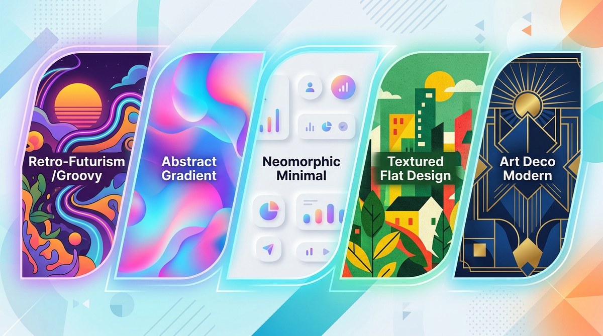
Retro-Futurism 2.0: The 90s and Y2K Revival
Retro-futurism has been simmering for a few years, but 2026 is the year it fully hits vector art. We are not talking about 80s synthwave. The new nostalgia pulls from late 90s and early 2000s aesthetics: shiny chrome text, translucent interface elements, and pixelated nods to early digital art.
This style works especially well for tech startups and gaming brands that want to evoke a sense of playful innovation. In vector terms, that means using gradients with metallic hues, rounded rectangles with inner glows, and layered transparent shapes.
Here is a breakdown of common elements:
- Chrome and glass effects (easy to build with gradient mesh or blends)
- Grid-based backgrounds with isometric perspective
- Small repeating icons or motifs (floppy disks, cursors, cell phones)
- Neon accent colors over dark backgrounds
One mistake designers make is overcomplicating retro-futurism. Instead of recreating an entire 90s desktop interface, pick one or two elements: a glossy button here, a pixelated border there. The effect should feel curated, not cluttered.
Maximalist Psychedelia: More is More
Minimalism has ruled for over a decade, but maximalism is roaring back in vector art trends 2026. This style embraces vibrant, clashing colors, layered patterns, and surreal composition. It is the visual equivalent of a loud playlist: energetic, chaotic, and impossible to ignore.
Maximalist vector art demands careful control of chaos. Without structure, it becomes noise. The trick is to use a strong focal point (a character, an object, or a bold word) and build the rest of the composition outward from there.
Useful techniques for maximalist vectors:
- Overlapping halftone patterns
- Conflicting textures (smooth gradients next to rough grain)
- Warped or distorted type
- Radial symmetry for mandala-like backgrounds
A bulleted list of common mistakes when starting:
- Using too many fonts (stick to one or two)
- Forgetting about negative space (you need tiny pockets of rest)
- Ignoring color theory (clash on purpose, but know why)
If you are worried about overwhelming your audience, test the illustration at a small size first. If the main message is still readable, you are on the right track.
AI-Resistant Authenticity: The Grain and Imperfection Movement
Perhaps the most significant driver behind these vector art trends 2026 is the desire for authenticity. Audiences are growing skeptical of images that look too perfect. Vector art that embraces visible brush strokes, irregular linework, and even intentional errors feels more trustworthy.
This is not about rejecting technology. It is about using vector tools to create work that looks like it could have come from a traditional studio. Texture overlays, scanned paper backgrounds, and limited color palettes all contribute to this look.
For branding projects, consider using the same style across multiple assets: a hand-drawn logo, textured social media templates, and packaging that mimics letterpress. Consistency in imperfection builds recognition.
If you want to learn more about blending digital precision with handmade charm, check out how to convert hand-drawn art into vector graphics. It walks through the entire workflow from sketch to export.
Your Vector Art Toolkit for 2026
Trends come and go, but the underlying shift in 2026 is clear: people want art that feels human. Whether you lean into neo-brutalism, retro-futurism, or maximalist psychedelia, the common thread is intention. Every texture, every wobble, every color clash should serve a purpose.
Start small. Pick one trend from this list and apply it to a personal project. Try layering grain over a flat vector. Or build a poster using only three colors and heavy outlines. See how the style changes the mood of your work. You might find that the “mistakes” you used to fix are exactly what your portfolio needs.
The best part? Vector software gives you unlimited undo. You can experiment without risk. So open a new document, pick a style that excites you, and let the comeback begin.