You open your vector software ready to create something amazing. But something looks off. Edges feel sloppy. Colors don’t pop. The file behaves weirdly when you scale it. Chances are you are making one or more of the common vector art mistakes that quietly sabotage your work.
These errors sneak in during the early stages of a project. They seem minor at first. But they add up. They make your final design look amateurish and cause hours of extra cleanup. The good news is that every single one of these mistakes is fixable. Once you know what to look for, you can spot and correct them within minutes.
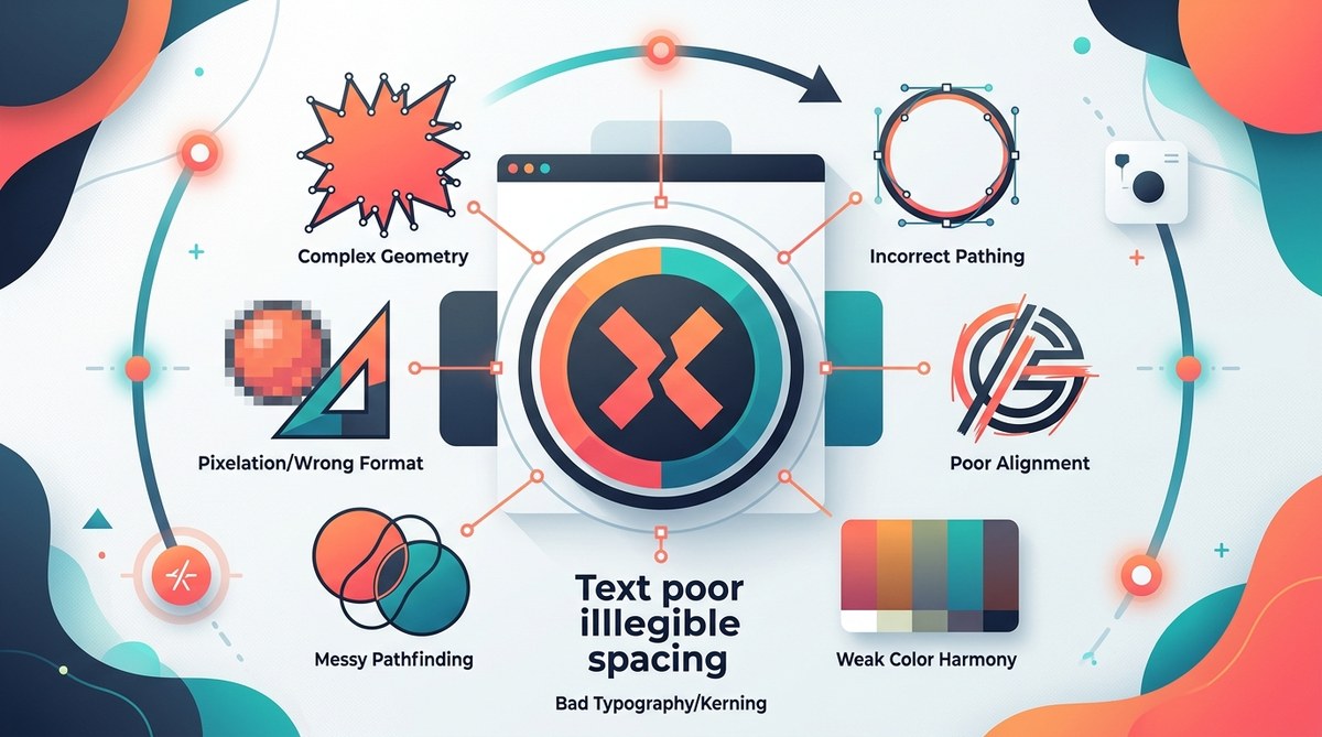
Vector art mistakes fall into a few predictable categories: path construction errors, color management slip ups, layer disorganization, and over complexity. By mastering a handful of core habits like building clean paths, using consistent color swatches, and naming your layers, you can eliminate 80 percent of the issues that bog down your workflow. The payoff is professional looking vector work that prints, scales, and animates perfectly every time.
The most common vector art mistakes designers make
Let us walk through the eight errors that appear most often in vector portfolios, client files, and social media feeds. Each mistake comes with a fix you can apply today.
1. Messy anchor points and broken paths
Have you ever zoomed in on a curve and seen a jagged, uneven line? That is a sign of too many anchor points. When you draw with a mouse or a tablet without snapping, you end up with extra points that create unnecessary bumps.
Other path problems include:
- Open paths that should be closed
- Paths that cross over themselves
- Overlapping strokes that create unintended fill shapes
- Spikes caused by overlapping curve handles
The fix is simple. Use the Simplify tool in your vector software. In Adobe Illustrator, go to Object > Path > Simplify. This reduces the number of anchor points while preserving the overall shape. Alternatively, rebuild the path from scratch using fewer points. A smooth curve needs only two anchor points and two handles.
| Mistake | What it causes | How to fix it |
|---|---|---|
| Too many anchors | Bumpy edges, large file size | Use Simplify or redraw with Pen tool |
| Open path | Fill leaks or missing area | Select path and press Cmd/Ctrl+J to join |
| Crossing handles | Spikes and distortion | Adjust handle direction with Direct Selection tool |
2. Forgetting to close paths before adding fills
You draw a fluid shape. It looks perfect on screen. Then you add a fill and half the shape disappears. The fill only appears in the gap between the start and end point. This is one of the easiest vector art mistakes to fix.
Always check that your paths are closed. Select the path and look at the anchor points. The first and last points should be joined. If they are not, use the Join command. For shapes that will be filled, it is best to draw them using the Shape tools (rectangle, ellipse, polygon) which close automatically.
Expert advice from a senior illustrator: “I see designers spend thirty minutes tracing a logo because they keep hitting the wrong anchor. Stop fighting the Pen tool. Use the Curvature tool instead. It handles smooth curves without adding extra points.”
3. Using too many stroke weights for a single illustration
A consistent line weight gives vector art a polished, intentional look. When you mix hair thin strokes with thick outlines on the same artwork, the piece feels disjointed. It draws the eye to the wrong places.
Stick to a small set of stroke weights. For example, choose 1 pt, 2 pt, and 4 pt. Use the thinnest for details, the medium for main outlines, and the thickest for emphasis. You can save these as Graphic Styles so you apply them with one click. This practice is especially important in logo design where consistency matters most. For more on this approach, check out our guide on
4. Ignoring color mode and swatch management
One day your vector art looks vibrant on your monitor. The next day you print it and the colors look dull and muddy. That happens when you work in RGB but the final output requires CMYK. Or when you use spot colors that don’t convert properly.
Use the correct color mode from the start. If your work is meant for screens, use RGB. If it goes to print, start in CMYK. Convert early to avoid surprises later. Also, build a custom swatch palette. Pull colors directly from it instead of picking random eyedropper values. This makes it easier to adjust hues later if the client changes their mind.
For a deeper look at how color choices affect brand perception, read our article on
5. Relying too much on raster effects
Raster effects like drop shadows, blurs, and textures can make a vector file bloated and slow. They also lose quality when scaled. A true vector artwork should maintain crisp edges at any size.
Instead of adding a Gaussian blur, try creating a vector equivalent. Use a gradient with multiple stops to simulate a soft shadow. Use transparency masks to fade objects. Or use patterns that are based on vector tiles. This keeps your file lightweight and resolution independent.
6. Not organizing layers and groups
You finish a complex illustration. Then you need to change a single element. But it is buried inside unnamed layers and nested groups. You spend ten minutes hunting for it. That is time wasted.
Get in the habit of naming every layer as you create it. Use descriptive labels like “background gradient” or “left eye highlight”. Group related objects and name the group. Use the Layers panel’s color coding feature to differentiate parts of the artwork. This is not just for your own sanity. It makes it easier to share files with other designers.
Here is a numbered process to keep your layers tidy:
- Before you start, create a layer structure: Background, Midground, Foreground, Details.
- As you draw each element, move it to the correct layer immediately.
- Name the sublayers with a consistent pattern: object name + color (e.g., “Leaf Green”).
- Lock layers you are not currently editing to avoid accidental moves.
- After finishing, collapse all groups and purge empty layers.
7. Making everything too complex
Some designers think more detail equals better art. But vector art shines when it is clean and purposeful. Too many shapes, gradients, and effects clutter the image. The concept gets lost.
Ask yourself: Does this line add meaning? Does this shadow improve readability? If not, remove it. Minimalist vector art often communicates stronger than busy compositions. Try limiting yourself to three shapes per element and two gradients per piece. You will be surprised how much clarity you gain.
For inspiration on simplifying your style, see our showcase of
8. Skipping the final preflight check
You export your vector art and send it to the client. They open it and find missing fonts, broken links, or misaligned objects. A preflight check catches these issues.
Before you save, run through this checklist:
- Outline all text (or include font files)
- Embed any linked images
- Align all objects to a grid or pixel grid
- Delete unused swatches, brushes, and symbols
- Expand appearances if you used effects
- Save a copy as a PDF for client approval and keep the native file for edits
This takes only two minutes but saves hours of back and forth.
Turning these fixes into habits
You now know the eight vector art mistakes that hurt your designs. Knowing is only half the battle. The real change happens when you integrate these fixes into your daily workflow.
Start with one mistake. For example, for the next three projects, focus only on building clean paths. After that, move to color mode consistency. Each habit will become automatic with repetition. Before long, your vector art will look cleaner, scale better, and need fewer revisions.
If you want to speed up your process even more, take a look at our workflow hacks in They pair perfectly with the fixes above.
Vector art is a powerful medium because it gives you total control over every point, every curve, and every color. When you remove the common mistakes, that control becomes a superpower. Your designs will stand out for all the right reasons. And you will enjoy the process a whole lot more.