You finish the logo. The client loves it. You send over the AI file and a PNG and think the job is done. Then, four months later, an email arrives: “Hi, our developer is asking for something called an ICO file?” That email is the reason this checklist exists. The handoff is not just the final step of the project. It is the thing that determines whether a client trusts you again, or whether they quietly go to someone else next time.
The Package Most Designers Are Still Getting Wrong
- Handing off only the native AI or EPS file leaves clients stranded the moment they need a format their printer or developer can actually open.
- Skipping web-specific formats like favicons and optimized SVGs is the single biggest reason clients email you six months after the project closes.
- A thorough, clearly labeled delivery folder is part of the professional product you are selling, not an afterthought you rush through before sending the invoice.
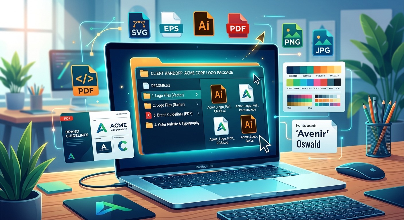
The Files That Actually Belong in a Logo Package
There is no universal industry law about what to send. But there is a practical standard that working designers converge on after enough client calls. A complete package covers four categories: master source files, print-ready files, screen-ready raster exports, and web-specific formats. Missing any one of these guarantees a follow-up email at the worst possible time.
Here is what each category covers and why it belongs in every delivery folder you send:
- Master source files: Your editable AI or EPS with all fonts outlined, all effects expanded, and layers organized. This is the archive copy no one touches until they need to rebrand.
- Print-ready PDFs: Vector PDFs with embedded color profiles. Printers, sign makers, and embroidery services all accept these without complaint.
- PNG exports: Transparent-background PNGs at multiple sizes. Minimum 512px, 1024px, and 2000px on the longest edge.
- Optimized SVG for web: A clean export with no stray points, no editor metadata, and named paths for developers who need to script against the file.
- Favicon set: A dedicated ICO file and at least a 192px PNG. Not optional if the client has a website, a web app, or a presence anywhere on the internet.
Why the SVG Master Is Not Enough on Its Own
Your raw Illustrator SVG is technically valid. It is also bloated with metadata your vector editor added automatically during every save. That metadata includes editor version tags, hidden layer identifiers, and sometimes embedded font references in formats web renderers handle inconsistently. The file your client’s developer receives should be a lean, deliberate export, not the working file you saved mid-session.
SVG files are plain text XML and fully resolution-independent, as the SVG 2 specification defines, which makes them ideal for responsive web use. The catch is that this only works cleanly when the file is properly structured. A raw Illustrator export often contains deprecated attributes, empty groups, and hidden paths that were never meant to ship to a browser. Take ten minutes to run your SVG through an optimizer before adding it to the handoff folder. The client’s developer will notice, and they will remember that you cared.
Print-Ready PDFs and the Color Profile Conversation
Most clients will at some point hand your logo file to a printer, a sign vendor, or a business card service. Those vendors work in CMYK. If you hand off only an RGB file, the colors the client sees on screen will not match what comes off the press.
Your print PDF should include at least two versions: one in CMYK and one in RGB with an sRGB color profile embedded. If the client has a Pantone color in their brand, add a version with spot color swatches intact and note the Pantone codes in a plain text document inside the folder. That note will save everyone a headache during production, sometimes years later.
The PDF Settings That Actually Matter for Production
When exporting from Illustrator for print handoff, use the PDF/X-1a or PDF/X-4 standard. PDF/X-4 is the better choice for files that include transparency effects. It preserves live transparency rather than flattening it, which gives press operators more flexibility at their end. Set bleed to 3mm if the logo runs to any edge, and embed all fonts even if you have already outlined the text in the source file. Belt and suspenders is the right mindset here.
PNG Exports and the Sizes That Cover Every Use Case
A single large PNG is not enough. Clients resize images badly. They stretch, compress, and crop without thinking twice. The safest move is delivering multiple sizes so the client always has a version close to what they need, without touching the original.
Here is the export workflow to run for every logo project before closing the file:
- Export a 2000px version on the longest edge at 300dpi as a baseline archival PNG with a transparent background.
- Export a 1024px version for social media profiles and presentation decks.
- Export a 512px version for general web use, email signatures, and app store listings.
- Export a 192px version specifically for Android home screen icons and progressive web app manifests.
- Export 32px and 16px PNGs for small-format use cases and as source material for generating the favicon.
Always export on a transparent background unless the client’s brand uses a locked background color. If the logo has a reversed version for dark backgrounds, export that set separately and label it clearly with a suffix like _reversed or _onDark.
The Web Formats Every Designer Leaves Out Until It Is Too Late
This is the section most handoff tutorials skip entirely. It is also the section responsible for the majority of those six-month follow-up emails. Web developers need more than a static PNG. They need a properly structured SVG for responsive scaling, a favicon set for the browser tab, and sometimes an Apple Touch Icon for iOS bookmarks. Treating these as optional extras is a mistake that costs you time and costs the client money.
The Favicon Problem Nobody Warns You About
Here is something that catches designers off guard the first time. Browsers do not reliably render an SVG file as a favicon. Most modern desktop browsers have added SVG favicon support, but mobile browsers and older systems still default to the ICO format. The ICO file can embed multiple resolutions inside a single file container, typically 16px, 32px, and 48px. That multi-resolution container is what browsers use when displaying your logo in a tab, a bookmark bar, or an OS taskbar.
You cannot rename a PNG to a .ico file and call it done. That creates a broken file that some browsers will silently ignore and others will display as a broken icon. The correct move is generating the ICO from your vector source using a dedicated converter. The tool I now keep permanently in my handoff workflow is SVG to ICO, which takes your vector file and outputs a properly structured ICO without requiring you to install extra software or leave your vector ecosystem. Add the resulting ICO file to the web formats folder in your delivery package, and note in your brand reference document which pixel sizes are embedded inside it.
How to Structure the Delivery Folder
A clearly organized folder is a signal of professionalism. A dump of files named “logo_final_v3_FINAL2.svg” is a signal that you rushed the end of the project. Folder structure takes five minutes to set up and makes a lasting impression on every person who opens that ZIP file.
The structure below is what I duplicate at the start of every logo project and then fill in during production:
01_Master_Files/ (AI, EPS, SVG raw)
02_Print_PDFs/ (CMYK and RGB versions)
03_PNG_Exports/ (organized by size)
04_Web_Formats/ (optimized SVG, ICO, Apple Touch Icon)
05_Brand_Notes/ (color codes, Pantone refs, font names)
Name every file with the client name, color variant, and format. Something like “acme_logo_fullcolor_rgb.svg” and “acme_logo_white_reverse_cmyk.pdf”. This labeling removes all ambiguity when the client is digging through that folder a year from now and cannot remember which version is which.
A Format-by-Format Reference for What Gets Used Where
Logo File Formats and Their Primary Applications
| Format | Best Use | Notes |
|---|---|---|
| AI / EPS | Archive and future editing | Requires Illustrator or compatible application to open |
| PDF/X-4 | Commercial print, signage, embroidery | Embed color profiles; deliver both CMYK and RGB versions |
| SVG (optimized) | Web, responsive UI, developer handoff | Strip editor metadata before including in the package |
| PNG (transparent) | Social media, decks, email signatures | Always deliver multiple sizes, not a single large file |
| ICO | Browser favicon | Multi-resolution container; 16px, 32px, and 48px minimum |
| PNG 192px | Android home screen, PWA manifest | Required for modern progressive web app support |
The Part of the Package Clients Read Last but Need Most
Include a one-page brand reference PDF in the 05_Brand_Notes folder. List the logo’s hex codes, RGB values, CMYK values, and Pantone equivalents if you have them. Name the typefaces used. Note any minimum size restriction for the mark, particularly the icon-only version if there is one. If the client has a full brand guide, this document supplements it. If they do not, this document becomes their de facto brand guide.
Clients rarely read it the day they receive it. They read it two years later when briefing a new designer or trying to match a color on a physical product. When that moment comes, having the reference there saves them money and keeps your work looking right in the world long after the project is closed.
Send the Package Before the Invoice Clears
This is the habit that separates reliable professionals from everyone else. Do not hold the files until the invoice is paid. Send the package when the work is approved. Invoice immediately after. The client receives the professional product they hired you for, and the relationship ends on a high note rather than a standoff.
Holding files over payment creates friction and signals distrust. It means the final interaction the client has with you is one of waiting, not receiving. The complete package, sent promptly, with clear folder labeling and a brief email walkthrough of what is included and what each folder is for, is the thing that generates referrals. It is the thing that makes clients describe you as easy to work with, which is worth more than any single project fee.
The Handoff That Does the Marketing for You
Build your delivery folder structure as a template you duplicate at the start of every logo project. Do the export work as a final production step, not as a scramble after approval. Label files as you go, not at the end when you are tired of looking at the project.
Every designer who has been on the receiving end of a confused client call eventually builds a system like this. The system is not complicated. It is just consistent. A client who opens your delivery folder and finds everything organized, labeled, and complete does not go looking for another designer next time. They send you the next project and tell someone else to call you.
The package is not overhead. It is the finish line. Cross it properly, every single time.