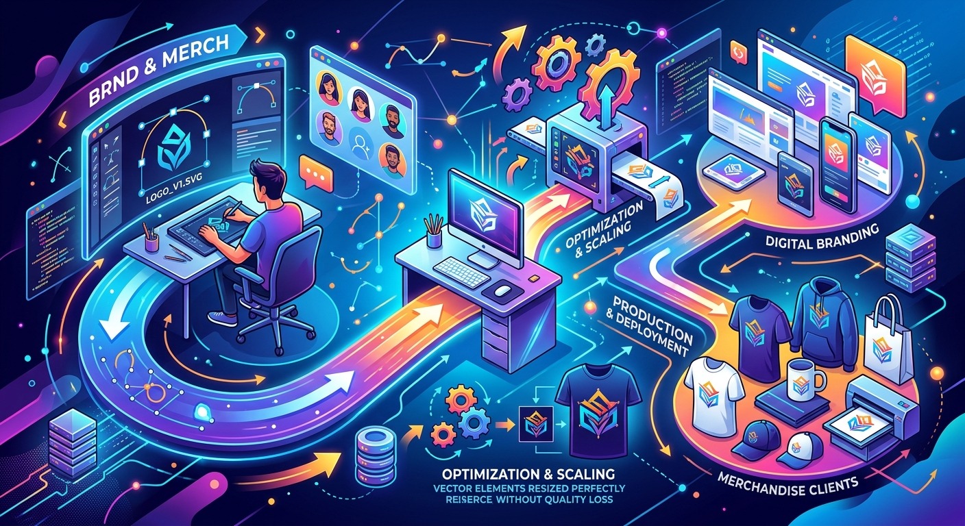
A client sends you a blurry JPEG at 72 DPI and tells you they need it on 500 tote bags by Thursday. That feeling in your stomach is a workflow problem, not just a file problem. The vector artists handling branding and merch at scale are not necessarily faster or more talented than you. They have built a system that absorbs client chaos without collapsing. This guide walks you through what that system looks like, from the moment a brief lands in your inbox to the moment you hand off final files, so the next chaotic project does not eat your whole week.
Workflow at a Glance
- Audit every client file before opening your software, because bad inputs compound into bad outputs.
- Get a structured SVG base early, then refine it in Illustrator or Inkscape rather than rebuilding from scratch.
- A repeatable delivery system turns a one-time project into a client who comes back.
The Brief Is Your Blueprint, Not a Suggestion
Most workflow problems start before you open a single file. They start in the brief, or more accurately, in the absence of a real one. When a client says “I need a logo,” that tells you almost nothing. What formats do they need? What will the design print on? What colors are locked in by their brand guidelines?
Build a simple intake form and send it to every new branding or merch client before the project kicks off. Ask for deliverable formats (SVG, EPS, PDF, PNG), intended use cases (screen, print, embroidery, vinyl cut), and the color system they are working in (Pantone, CMYK, RGB). Ask whether they have existing brand guidelines. Ask whether they can supply original source files.
That last question matters more than most designers admit. Clients almost always say yes, then send you a PNG they pulled off their own website. Getting that out of the way early means you can plan for it rather than scramble when the deadline is already close.
Keep the intake form short enough that clients actually fill it out. Five to seven targeted questions beat a sprawling survey they abandon halfway through. Once this form becomes part of your standard process, it stops feeling like admin and starts feeling like armor.
Auditing Client Files Before You Touch a Tool
Once you have the brief and the source files, resist the urge to open Illustrator immediately. Run a file audit first. This takes ten minutes and saves hours later.
Check the resolution and format of every asset they have sent. Raster files under 300 DPI are going to create problems the moment a design needs to scale up for a banner or a large-format print. Logo files supplied as RGB JPEGs will need color conversion for print jobs, and that conversion is never as clean as starting in the right color mode from the beginning.
Look at what you actually have against what the project needs. If you are designing for both a website header and a printed patch on a hoodie, you need a vector that handles both contexts. That means clean, closed paths, no raster effects that will not translate to the garment decorator’s software, and stroke weights that hold up at small sizes.
Flag every mismatch in a running notes document before you start designing. That document becomes your internal reference when a client questions why something looks different from their original file. It also becomes the paper trail that protects you when a client insists their source was fine.
Getting a Clean SVG Starting Point
Here is where a lot of vector artists lose time they cannot get back. They receive an unusable raster from a client and immediately start redrawing from scratch. That is sometimes the right call, but it is not always necessary.
If the client’s original is a reasonably clean, simple image, you can create SVG output as a structured base file before refining it in Illustrator or Inkscape. This gives you a workable vector skeleton to adjust rather than an empty artboard staring back at you. The paths will not be perfect. But the proportions and overall structure are there. You clean up anchor points, simplify curves, and close any open paths rather than tracing the whole composition from zero.
Treat that base file as a starting point, not a finished product. Use it to get proportions right, map out the major shapes, and confirm the composition works before committing hours to path refinement. For logos with intricate linework, this approach can cut your prep time significantly.
Once you are working in Illustrator or Inkscape, run a short technical check: confirm the artboard is sized to your primary output spec, make sure all type has been converted to outlines, and verify that no stray points or open paths are hiding in the file. These are the details that bite you at 11 PM the night before a deadline.
Structuring Your Layers and Artboards for Consistency
A well-structured file is a gift to future you and to any other designer who might touch the project later. Layer naming conventions, logical grouping, and consistent artboard sizing are the difference between a handoff that goes smoothly and one that generates three rounds of confused emails with everyone copying the printer.
For branding projects, a layer structure that works reliably includes these components:
- Primary mark: the full lockup, including icon and wordmark together
- Icon only: the isolated symbol with no text, sized to a square artboard
- Wordmark only: the logotype without the icon, for use in tight horizontal spaces
- Color variants: full color, single color, reversed white on dark, and one-color black
- Clearspace guides: a locked guide layer showing minimum padding rules around the mark
On merch projects, add artboard variants for each product type. A design that works on a T-shirt front chest placement does not automatically work for a hat or a sticker sheet. Size each artboard to the actual print area, not a generic square. This makes it immediately clear to a printer or decorator exactly what they are working with, and it prevents the kind of misalignment that generates expensive reprints and awkward conversations.
Consistent naming conventions across every file you deliver build trust over time. When a printer opens your file and everything is where they expect it, you become the designer they request by name on the next job.
Handling Format Mismatches and Scaling Errors
Format mismatches are the most common source of rework on branding and merch projects. A design approved on screen looks different in print because the color mode was wrong. A logo that looked sharp on a mockup falls apart when the embroidery machine reads the file because the paths were too complex or the stroke widths too thin to register cleanly.
SVG scaling is one area where understanding the underlying specification pays real dividends. The viewBox attribute controls how an SVG scales relative to its container, and getting it wrong produces designs that shift, crop, or distort when placed in a different context. Spending time with SVG 2 coordinate system documentation will clarify exactly how viewBox and preserveAspectRatio interact and why files behave unexpectedly in web contexts versus print pipelines.
For print, always export to EPS or PDF in CMYK alongside your SVG. Confirm with the printer which format they prefer and whether they need Pantone color values specified in the file or in a separate reference sheet. For digital, export optimized SVGs with no metadata bloat and test them in at least two browsers before delivering to the client.
Build a test file for each new client type where you check the design at its smallest intended size. If the logo needs to fit on a pen cap, test it at pen-cap size, not just at 500 pixels wide on your monitor. Small-size failures are almost always invisible at large scale and catastrophically obvious in production.
Building a Delivery System That Survives Client Chaos
The final delivery package is where many otherwise solid workflows fall apart. Designers send a zip of files with no naming convention, no guide, and no direction on which file to use for which purpose. The client opens the wrong one, sends it to a printer, and emails you because the colors look wrong. Nobody is happy. Everybody wastes time.
A structured delivery folder prevents this pattern from repeating. For every branding or merch project, include:
- A clearly named master folder with the client name and project date in the folder title
- Subfolders by format: Print (EPS, PDF, CMYK), Digital (SVG, PNG, RGB), and Source (native AI or Inkscape file)
- A plain-text or PDF usage guide written in language a non-designer can follow, telling the client which file to open and when
- Pantone and exact color references included in the guide itself, not just embedded in the files where a client will never find them
When you deliver this way consistently, client errors drop. Reprint costs drop. The number of “small favor” emails asking you to resend files in a different format drops too. The system does not need to be elaborate. It needs to be consistent. A folder structure you can replicate in two minutes on every project is worth more than a sophisticated setup you only use sometimes.
From Brief to File: Making Every Project Easier Than the Last
A scalable SVG workflow is not a single clever trick. It is a chain of small, deliberate decisions that compound over time. A thorough brief means fewer surprises in the file audit. A clean base file means cleaner paths in the refined deliverable. A consistent layer structure means faster exports. A standard delivery package means fewer support requests after handoff.
Every project you complete using this system gives you a template for the next one. Client intake forms get sharper. Layer conventions become second nature. The chaos that used to derail your timeline gets absorbed before it reaches your artboard.
Branding and merch clients return when working with you feels reliable. That reliability is not about being perfect on the first pass. It is about having a process that makes the entire project, from first email to final file, predictable for both of you. Build that process once, refine it as you go, and it pays you back on every project that follows.