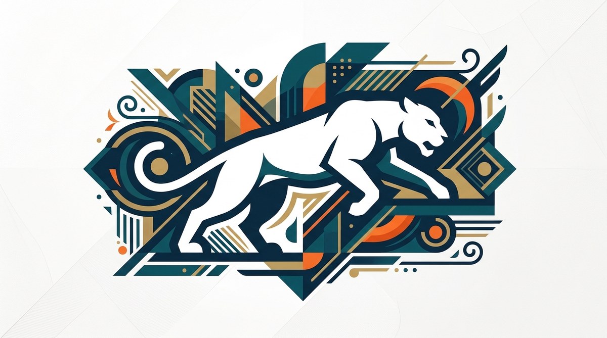
Most designers spend all their energy on the shapes they draw. The curves, the angles, the gradients. But the area around those shapes holds just as much power. That empty space, the gap between forms, the background that frames your subject, is what makes vector art feel intentional, clever, and polished. When you start treating the empty parts of your canvas as active elements instead of leftover space, your work transforms. You stop fighting for attention with more lines and start earning it with smarter composition.
Negative space is not an absence of design. It is a deliberate tool that gives your vector illustrations and logos structure, readability, and visual wit. By mastering techniques like figure-ground reversal, hidden imagery, and balanced white space, you can create work that feels more professional without adding complexity. This article covers the practical methods and common pitfalls every vector artist should know.
Why Negative Space Matters in Vector Art
Vector art is built on clean lines and solid fills. Unlike raster painting, where you can blend and soften edges, vector shapes have hard boundaries. That makes the relationship between filled areas and empty areas more visible. Every gap, every hole, every margin becomes part of the composition.
Think about a logo for a national park. The designer might place a tree shape inside a circle. That is the positive space. But what if the negative space between the branches also forms an animal silhouette? Suddenly the logo tells two stories at once. That is the hidden power of negative space in vector art design. It rewards repeat viewing. It makes the mark memorable.
Professional designers use this technique to communicate more with less. A single vector shape can carry a brand name, a product idea, and an emotional cue, all through the strategic use of empty areas. When you are working in a medium where every anchor point costs you time, negative space gives you more meaning per curve.
The Core Techniques for Using Negative Space
There are three main ways to apply negative space in vector illustrations and logos. Each one changes how the viewer reads your work.
| Technique | How It Works | Best Use Case | Common Mistake |
|---|---|---|---|
| Figure-ground reversal | The positive shape and the background shape both form recognizable objects | Logos and icons where you want a hidden meaning | Making both shapes too complex so neither reads well |
| Internal cutouts | Removing areas inside a shape to suggest detail (eyes, windows, folds) | Character design, lettering, architectural illustration | Cutting too much and losing the silhouette |
| Compositional breathing room | Leaving large empty areas around your main subject | Posters, hero graphics, social media assets | Centering everything and ignoring the rule of thirds |
Each technique relies on the same principle: the viewer’s brain will try to complete the pattern. When you leave a strategic gap, the mind fills it in. That engagement is what makes negative space vector art feel clever.
Figure-Ground Reversal in Practice
This is the technique behind the famous FedEx arrow and the panda in the WWF logo. You draw one shape, but the empty space around it or inside it creates a second image. In vector software, you can achieve this by using the Pathfinder tool to subtract one shape from another.
For example, to create a wine glass logo where the stem is also a vine:
1. Draw the outline of the glass as a single path.
2. Create a separate shape for the vine that overlaps the stem area.
3. Use the Subtract function to remove the vine shape from the glass.
4. The remaining empty area now reads as the vine.
This works because the human eye is trained to see faces and objects even when they are only suggested.
Internal Cutouts for Detail
When you are building a vector character or a detailed icon, you often need to show features like eyes, buttons, or folds without adding extra outlines. The cleanest way is to cut those details out of the main shape. This keeps your vector file light and your silhouette readable.
Consider a simple bear icon for a clothing brand. Instead of drawing the bear’s ear as a separate shape next to the head, you can cut a small curve out of the head shape. The remaining area around that cut forms the ear. This reduces anchor points and makes the icon scale better across different sizes.
“The best negative space designs are the ones where the viewer feels smart for noticing the trick. If you have to explain it, the execution is too subtle.” – Marian Bantjes, graphic artist
A Practical Process for Adding Negative Space
If you are new to thinking about empty areas, follow this numbered process to build the habit into your workflow. It works for both logos and illustrations.
-
Start with a solid silhouette. Before you add any internal details, look at the outer edge of your subject. Can you read what it is from the outline alone? If not, simplify. A strong silhouette is the foundation of good negative space.
-
Identify the secondary message. What else could your subject represent? If you are drawing a tree, could the gap between the trunk and the branches form a bird? If you are drawing a letter, could the counter space inside the ‘e’ become a leaf? Sketch these possibilities on a separate layer.
-
Test the overlap. Use boolean operations like Union, Subtract, and Intersect to merge your primary shape with the secondary shape. This is where you see if the idea works. If the secondary image gets lost, adjust the scale or position.
-
Refine the balance. A negative space trick should not dominate the composition. The primary subject must still read first. The hidden image should feel like a reward for looking closer, not a puzzle that blocks the main message.
-
Check at small sizes. Scale your design down to 50 pixels wide. Can you still see both images? If the negative space disappears, increase the gap size. This is especially important for logos that will appear on social media avatars or favicons.
For more on building a solid foundation with vector shapes, check out this guide on mastering vector art techniques for stunning digital creations.
Common Mistakes That Ruin Negative Space
Even experienced designers fall into these traps. Here is what to watch for.
- Overcomplicating the cutouts. You do not need every detail to be a negative space trick. One clever moment per design is enough. Too many cutouts make the image look like Swiss cheese.
- Ignoring the background color. Negative space only works if the background is a consistent color. If your design will sit on multiple backgrounds, test it on both light and dark surfaces. A white cutout that looks clever on a black background might disappear on a white one.
- Making the gap too thin. Thin negative areas vanish when the design is printed small or viewed on a phone screen. Use the same stroke weight logic you would for any outline. If the gap is thinner than your smallest intended display size, widen it.
- Forgetting the brand context. A negative space trick that works for a toy company might feel too cute for a law firm. Always match the cleverness to the brand personality.
If you are noticing these issues in your own work, you might also want to read about 7 vector art mistakes that are ruining your designs. It covers similar traps for the overall vector workflow.
When to Use Negative Space vs. When to Avoid It
Negative space is not always the answer. Knowing when to lean into it and when to keep things straightforward is part of becoming a confident designer.
Use negative space when:
– The design needs to work in one color (like a stamp, a watermark, or a screen print).
– You want to create a memorable logo that people will recall after a single glance.
– You are designing icons for an interface where simplicity is critical.
– The brand story has a natural dual meaning (a bookstore with a hidden reading figure, a music app with a hidden note).
Avoid negative space when:
– The target audience is very young or very old. Children and older viewers sometimes struggle to parse figure-ground reversals.
– The design will be animated. Moving cutouts can create distracting moire effects or flickering gaps.
– The client has a very literal brief. Some brands want their logo to be exactly what it shows, no hidden messages.
For more on when minimalism works best, see why minimalist vector art is dominating branding in 2026.
Tools and Settings for Better Negative Space Control
Your vector software has specific features that make negative space design easier. Here are the ones worth mastering.
- Pathfinder panel (Illustrator) or Shape Builder. These let you combine and subtract shapes without destroying the original paths. Work on a copy of your shapes so you can revert if the subtraction does not work.
- Outline mode. Toggle to Outline view (Cmd + Y on Mac, Ctrl + Y on Windows) to see only the paths. This strips away fills and strokes so you can judge negative space purely by the gaps between lines.
- Global edit and symmetry. If you are designing a symmetrical logo, use a vertical guide and build only one half. Mirror it at the end. This ensures your negative space is perfectly balanced on both sides.
- Grid and snap to pixel. When negative space gaps need to be exactly the same width across multiple cutouts, enable the grid and snap to grid. This keeps gaps consistent and avoids uneven spacing that looks sloppy.
Setting up a proper workspace can save you hours. The article on 10 vector art tools every designer should master by 2026 covers more workflow essentials.
Real Examples You Can Learn From
Some of the most famous logos in the world rely entirely on negative space. The arrow in the Amazon logo connects the ‘a’ to the ‘z’ and also suggests a smile. The Toblerone mountain hides a bear in the negative space between the peak and the text. The Spartan Golf logo uses the space between the golfer’s arms to form a spear.
These designs work because the negative space is not decorative. It is structural. It carries meaning that the positive shapes alone could not deliver.
Study these examples by tracing them in your vector software. Rebuild them from scratch. You will notice that the gaps are never accidental. Every curve on the inner edge is there because it creates a specific shape on the outer edge.
How to Present Negative Space Concepts to Clients
Clients sometimes react with confusion when they first see a negative space trick. They might miss the hidden image entirely. To avoid this, present your work in stages.
Show the primary shape first. Let them approve the main concept. Then reveal the negative space element as a bonus layer. This frames the trick as added value rather than the core idea. If the client does not like the hidden element, you can remove it without losing the main mark.
When you explain the design, use simple language. Do not use terms like “figure-ground reversal” or “gestalt closure.” Instead say, “The space between these two lines also forms the shape of a leaf, which reinforces the natural theme of the brand.”
For more on handling client feedback, read what to include in a professional vector logo package at client handoff.
Putting Negative Space to Work in Your Next Project
Negative space in vector art design is not a gimmick. It is a fundamental skill that separates beginner work from professional work. The next time you open your vector software, start with the empty areas. Before you draw a single line, think about what the background could say. Consider what shape the gap between your forms might take.
Draw a simple rectangle. Cut a circle out of it. Now that circle is not a hole. It is a moon, a lens, a target, a bubble. The empty space becomes the subject. That shift in thinking is the hidden power you have been missing.
Start small. Redesign a common icon like a house, a tree, or a coffee cup using only negative space to show the details. No extra lines. Just cutouts. You will feel the difference in your file size, your export speed, and the clarity of your message.
For your next step, look at how to craft unique vector art for brand identity in 2026 and apply these negative space techniques to a full brand system.
The Real Reward of Mastering Empty Space
When you finally nail a negative space design, the reaction is not just praise. It is a pause. People stop scrolling, they tilt their head, they smile. That moment of recognition is what makes vector art memorable. It is the difference between a logo that people glance at and a logo that people remember.
You do not need to turn every design into a puzzle box. One well placed gap, one clever cutout, one intentional empty area can carry the whole composition. The next time you sit down to design, give the empty space the same attention you give the filled space. Let the nothing speak as loudly as the something.
That is the hidden power of negative space in vector art design. It is not about what you leave out. It is about what you let the emptiness say.