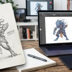
Between your design files and the final screen, there is a layer that never blurs, never pixelates, and never breaks your grid. Vector art is that layer. If you design interfaces, you already rely on it every time you drop an icon into a button or build a character illustration for an onboarding flow. The difference between a good UI and a great one often comes down to how well you handle those vectors. Let us walk through exactly how vector art fits into modern UI/UX design, with steps, tools, and real 2026 workflows that keep your icons and illustrations crisp at any size.
Scalable icons and illustrations begin with vector art. In UI/UX design, vectors let you resize without losing quality, change colors in an instant, and keep file sizes small. This guide covers why vectors matter for interfaces, how to build a systematic icon set, common mistakes to avoid, and the process of turning vector art into production-ready SVGs. By the end, you will have a repeatable workflow for any screen size.
## Why Vector Art Is Non-Negotiable for UI/UX Design
Raster images fall apart when you stretch them. A logo that looks sharp at 48 pixels turns into a blurry mess at 200 pixels. Vectors solve that because they store math, not pixel data. A circle is a set of coordinates, not a group of colored squares. That means your icons and illustrations will look the same on a smartwatch, a tablet, and a 50-inch monitor. For UI/UX design, this consistency is not just a nice to have. It is a core requirement.
Think about the last time you resized a button icon in Figma. If the icon was a vector, you dragged a corner and moved on. If it was a PNG, you had to find a larger size or export a new version. That friction adds up. Over the course of a product cycle, vector art saves you hours of re-export work.
Another reason vector art fits UI/UX design so well is color management. Design systems often require multiple states for every element: default, hover, active, disabled. With vector shapes, you can toggle a fill color with one click. Raster files would force you to create separate assets for each state.
## The Building Blocks of a Scalable Icon Set
When you design icons for a UI, you are not making art. You are making a functional system. Each icon needs to look like it belongs to the same family. That means consistent stroke weights, rounded corners that match, and similar visual density. Here are the key components to get right.
– **Grid alignment.** All icons should fit inside the same bounding box (for example, 24 x 24 pixels). The grid helps you keep spacing consistent.
– **Stroke weight.** Pick one stroke width and stick to it across the set. Common choices are 1.5px, 2px, or 3px. Mixing strokes makes the set feel uneven.
– **Corner radius.** Keep rounded corners identical on all shapes. A 2px radius on one icon and 4px on another will break visual harmony.
– **Padding.** Leave a safe inner margin (usually 1 or 2 pixels) so the icon does not feel cramped or clipped on export.
A bulleted list like this helps you scan the rules before you start drawing. Print it out or pin it above your desk.
## A Step-by-Step Process to Create Vector Icons for UI
Building a consistent icon set does not have to be complicated. Follow these five steps to move from idea to a clean SVG file.
1. **Start with a sketch.** Even if you use a mouse, draw a rough version on paper or with a basic shape tool. Define the core silhouette before you refine details.
2. **Build the base grid.** In your design tool (Figma, Adobe XD, Sketch, or Illustrator), create a square frame. Most UI icon sets use 24×24 or 32×32 pixels. Lock the grid as a guide.
3. **Draw the primary shapes.** Use the pen tool or simple geometric primitives (rectangles, circles, polygons). Keep the number of anchor points low. Every extra point adds file size and potential rendering issues.
4. **Apply consistent styling.** Set stroke weight, corner radius, and fill color according to your design system spec. Check alignment using the tool’s alignment tools.
5. **Export as SVG.** Modern design tools let you copy SVG code directly or export a file. Name your icon with a clear convention like `icon-user.svg` and organize it in a folder per category.
If you need a deeper look at the process, check out our guide on [mastering vector art techniques for stunning digital creations](https://bloodsweatvector.com/mastering-vector-art-techniques-for-stunning-digital-creations/). It covers shape building, path simplification, and advanced anchor point editing.
## Table of Common Mistakes and How to Fix Them
Even experienced designers make these errors when working with vector art for UI. The table below lists the most frequent problems and the right way to handle them.
| Mistake | What It Looks Like | Fix |
|———|——————-|—–|
| Overlapping paths | Icon has double lines where shapes intersect | Use the boolean operations (Union, Subtract) to merge shapes into a single compound path |
| Uneven stroke weights | Some lines look thicker than others | Define a standard stroke value in your design system and apply it globally |
| Missing corner rounding | A set where some corners are sharp and others are round | Apply the same corner radius to all rounded elements; use live corner widgets |
| Too many anchor points | File size bloats and vector edges look bumpy | Simplify paths by removing redundant points with the simplify tool |
| Inconsistent padding | Icons appear different sizes even on the same grid | Use a padding layer inside the grid frame and snap all elements to it |
Fix these five issues, and your vector icons will look professional across every screen.
## Illustrations That Scale Without Sacrificing Personality
Icons are the workhorses of a UI. Illustrations are the soul. A well-placed vector illustration can turn a dry error page into a moment of delight. The same scalability rules apply, but illustrations give you more room for expression. Instead of a single stroke weight, you might use variable line thickness to create depth. Shadows can be done with overlapping shapes rather than raster blur effects.
When you design illustrations for UI/UX, keep the file size in mind. A single illustration with hundreds of anchor points can slow down a webpage. Optimize your paths. Remove hidden points. Group flat shapes instead of using many gradient fills. If you want to see where illustration styles are heading this year, read our article on [emerging digital illustration styles to watch in 2026](https://bloodsweatvector.com/emerging-digital-illustration-styles-to-watch-in-2026/). It highlights trends like line art with accent colors and 3D-inspired flat compositions.
## Integrating Vector Assets with Your Design System
A design system is only as strong as its asset library. When you store vector icons and illustrations inside a shared component set, every team member can grab the same up-to-date version. Figma’s component properties and variants make this especially smooth. You can set a boolean toggle to swap between filled and outlined versions, or use text overrides to change icon labels.
For SVG export, make sure your vectors are optimized for web. Remove unused groups, convert text outlines to shapes if needed, and run the SVG through a minifier. A clean SVG file loads faster and is easier for developers to colorize via CSS. Learn more about workflow tricks in our post on [5 vector art workflow hacks to speed up your design process in 2026](https://bloodsweatvector.com/5-vector-art-workflow-hacks-to-speed-up-your-design-process-in-2026/).
> **Expert tip.** Name your layers with the same logic you would use for CSS classes. For instance, a search icon could be `icon/search/default`. When developers inspect the exported SVG, they see meaningful IDs instead of `Layer_32_copy`. That small habit saves hours of communication.
## How to Use Vector Art for Interactive Prototypes
Vector art does not stop at static screens. Because vectors are structured as paths, you can animate them easily. A loading spinner made of rotating arcs is just a vector path with a stroke dasharray. A button icon that morphs into a checkmark uses the same vector points but shifts their positions over time.
In prototyping tools like Principle or Protopie, you can animate vector properties directly. Scale, rotate, and morph without worrying about pixelation. This makes vector art ideal for micro-interactions. If you are building a dashboard with animated charts, the lines and bars should be vectors so they resize smoothly when the user resizes the browser.
For deeper insight into how vector assets strengthen brand identity, see our resource on [how to craft unique vector art for brand identity in 2026](https://bloodsweatvector.com/how-to-craft-unique-vector-art-for-brand-identity-in-2026/). It goes into color palettes, brand mascots, and system-wide illustration styles.
## Tools That Make Vector Work Easier in 2026
You do not need a dozen apps to create vector art for UI/UX. Most designers stick with one primary tool and a couple of plugins. Here are the most common setups:
– **Figma.** The industry standard for UI design. Vectors are native, and you can pull icons from community libraries or draw them inline. Use the “Vector” tool for freeform shapes and the “Boolean groups” for complex icons.
– **Illustrator.** Better for detailed illustrations and complex path work. Once you finish, bring the art into Figma via SVG or the “Copy as SVG” option.
– **Affinity Designer.** A budget-friendly alternative that offers pixel-perfect alignment and unlimited artboards. It handles large illustration files better than some competitors.
– **IcoMoon or SVGOMG.** Free tools to optimize and clean up SVG code after export.
## Common Questions About Vector Art in UI/UX
**Is vector art always better than raster?**
For UI elements, yes. For photographic images or complex textures, rasters still win. But icons, logos, illustrations, and interface graphics should always be vectors.
**Can I use vector art for mobile design?**
Absolutely. In fact, mobile screens vary so much in resolution that vectors are the only safe option for anything that needs to be crisp across devices.
**How do I hand off vector assets to developers?**
Export as SVGs. Provide a zip file with a clear folder structure. Include a naming inventory so developers know where each asset goes.
For a broader look at free resources to populate your design system, read [exploring the best free vector resources for creative projects](https://bloodsweatvector.com/exploring-the-best-free-vector-resources-for-creative-projects/).
## Moving Your Vector Skills Forward
Vector art is not a trend. It is the backbone of modern UI/UX design. Every icon you draw, every illustration you place, and every animated micro-interaction you build lives or dies by how well you handle paths, points, and scaling. Start small. Pick one icon set you use daily and rebuild it from scratch using the grid and stroke rules above. Then compare the new version to the old one. The difference in consistency will surprise you.
As you grow, keep an eye on new techniques. The [top trends in vector artwork that every designer should know](https://bloodsweatvector.com/top-trends-in-vector-artwork-that-every-designer-should-know/) page highlights what is changing in 2026. And if you ever get stuck, remember that the smartest designers spend more time deleting anchor points than adding them. Simplify. Align. Export. That rhythm will carry you through any project.