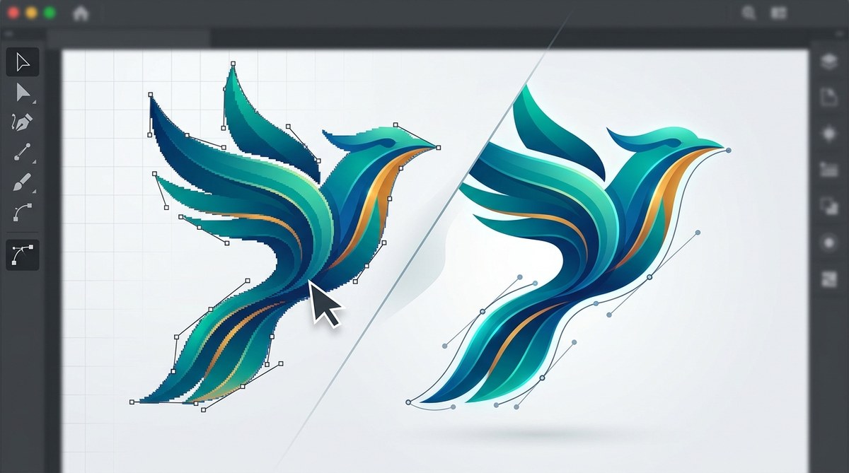
Those rough, stair-step edges on a curve you thought was perfect. You zoom in, and there they are: tiny jagged lines that make your vector art look more like a pixel game than a professional illustration. It happens to everyone, whether you are building a logo in Adobe Illustrator or refining a detailed piece for a client. The good news is that you can fix jagged edges in vector art without sacrificing the crispness that makes vectors so powerful. Let’s walk through the exact methods that preserve your quality.
Jagged edges in vector art usually come from too few anchor points, incorrect anti-aliasing, or export settings that rasterize your work. The fix involves smoothing paths, adjusting document raster effects, and choosing the right export format. You can keep every curve sharp and scalable without degrading the original file.
Why Vector Art Gets Jagged in the First Place
Vector art is math. Curves are calculated, not drawn pixel by pixel. So when you see a jagged edge, it is usually a display or export problem, not a flaw in the math itself. The most common culprits are:
- Low anchor point density on a curved path. A circle with only four points looks like a diamond.
- Pixel preview mode in Illustrator. This shows a rough approximation of how the art will look on screen, which can be misleading.
- Anti-aliasing disabled in your software or operating system. Without it, diagonal lines turn into stair-steps.
- Exporting at too low a resolution or using a format that forces rasterization, like a low-quality PNG.
Understanding the cause helps you pick the right fix. Most of the time, the solution is simpler than you think.
The Numbered Fix List: 5 Ways to Smooth Jagged Edges
Here is a step-by-step process that covers the most effective methods. Try them in order, because each one targets a different layer of the problem.
-
Add more anchor points to curved paths. Select the path with the Direct Selection tool (A). Go to Object > Path > Add Anchor Points. This doubles the number of points on the selected segments, giving the curve more data to work with. For fine control, use the Pen tool to place points manually where the curve looks off.
-
Apply the Smooth tool. Double-click the Smooth tool in the toolbar to adjust its settings. A higher Fidelity value means less change to the original shape. Drag the tool along the jagged section. It will reduce sharp angles without deleting the overall form.
-
Check your Document Raster Effects Settings. Go to Effect > Document Raster Effects Settings. Set the resolution to High (300 PPI) and choose “Anti-alias” as Optimized (Art Optimized for text and shape, Type Optimized for type). This setting affects how Illustrator renders drop shadows, glows, and other effects that might introduce jaggies.
-
Toggle Pixel Preview off. View > Pixel Preview should be unchecked unless you are designing for a specific screen grid. When it is on, you are seeing a simulated raster version of your vector. That simulation often looks rough even when the vector is perfect.
-
Export at 2x or 3x scale for screen use. If you need a PNG, export the art at 200% or 300% of the target size, then scale it down in an image editor. This oversampling technique smooths the edges naturally because the rasterizer has more pixels to work with.
Common Fixes vs. Common Mistakes
Not every solution works for every situation. Here is a table that compares techniques with the pitfalls that designers often run into.
| Technique | Best For | Common Mistake |
|---|---|---|
| Add anchor points | Curves that look polygonal | Adding too many points creates a bumpy path |
| Smooth tool | Organic shapes and hand-drawn lines | Over-smoothing removes intended detail |
| Increase raster effects resolution | Art with gradients or effects | Forgetting to re-apply after changing settings |
| Export at higher scale | Final PNG or JPEG output | Scaling up a low-res source makes jaggies worse |
| Use SVG format | Web and responsive design | Embedding too many unused points bloats file size |
The Anti-Aliasing Secret Most Designers Miss
Anti-aliasing is the software trick that blends the edge of a shape with the background color. Without it, diagonal lines look like a staircase. With it, they look smooth. But here is the catch: vector programs do not always apply anti-aliasing the same way.
In Adobe Illustrator, the anti-aliasing behavior changes depending on the document’s GPU Performance setting. Go to Edit > Preferences > Performance and make sure GPU Performance is enabled if your system supports it. This turns on hardware-accelerated rendering, which produces smoother on-screen previews.
For export, always choose the “Art Optimized” anti-aliasing option in the Export for Screens dialog. It prioritizes the smoothness of your vector shapes over text, which is usually what you want.
“The difference between a pro vector and an amateur vector is often just three anchor points and a correctly set anti-aliasing option. Spend the extra minute to check both before you export.” — Chris Spooner, vector illustrator and educator
Bullet Points for a Jagged-Free Workflow
Keep this checklist handy the next time you are finishing a piece.
- Zoom to 400% and inspect every curve before export
- Use the Outline mode (Ctrl + Y) to see the actual path structure
- Delete unnecessary anchor points with the Simplify tool (Object > Path > Simplify)
- Set your document to RGB for screen work, CMYK for print, and match the raster effects to the final medium
- Always save a master vector file (AI or SVG) before exporting flattened versions
When Jagged Edges Are Actually a Feature
Sometimes a jagged edge is intentional. Low-poly art, pixel art inspired vectors, and certain retro styles rely on hard edges. If that is your goal, you can lean into it. But if you want smooth, professional curves, the methods above give you full control.
If you are working on a brand identity project that demands flawless curves, check out our guide on how to master anchor points and curves for flawless vector lines. It covers the same techniques from a different angle, with more emphasis on pen tool precision.
Your Vector Art Deserves Smooth Curves
Jagged edges are not a sign of bad art. They are a sign of a setting that needs tweaking or a path that needs a few more points. You now have a clear set of actions to fix them without losing the quality that made you choose vectors in the first place.
Next time you open a file and see those rough lines, run through the numbered list. Start with anchor points, check your raster effects, and export smart. Your curves will stay smooth, your clients will stay happy, and your work will look as sharp on a billboard as it does on your screen.