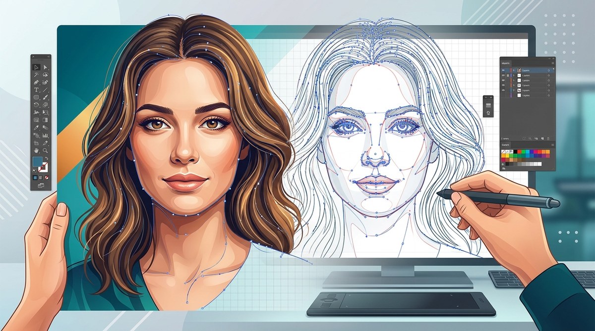
Making a vector portrait that actually looks like a real person is one of the most satisfying challenges in digital art. You have the precision of curves and anchor points, but you want the warmth of skin, the softness of hair, and the spark in someone’s eyes. It is entirely possible to achieve photographic realism using pure vectors. The key is knowing which techniques to use and when to use them.
Realistic vector portraits depend on mastering gradient meshes, layered transparencies, and strategic highlight placement. Avoid flat colors and rigid outlines. Focus on building form with overlapping shapes and soft blends. Use reference photos with strong lighting. Practice skin tone mixing and hair strand grouping to add depth without raster textures.
Why Vector Art Works for Realistic Portraits
Vector software like Adobe Illustrator and Affinity Designer gives you total control over every curve and color stop. Unlike raster painting, you can adjust a single anchor point without degrading the image. This makes vector art portrait techniques ideal for client work where you need to tweak a likeness or change a background color at the last minute.
The biggest myth is that vectors can only produce flat, cartoonish results. That is simply not true. With the right approach, you can build skin that looks porous, eyes that reflect light, and hair that flows naturally. The secret is not in the tool itself but in how you layer your shapes.
The 3 Core Techniques for Realistic Vector Portraits
These three methods form the backbone of every realistic vector portrait. Master these, and you can handle any face.
1. Gradient Mesh for Continuous Skin Tones
Gradient mesh is the most powerful tool for realistic skin. It allows you to create a single object with hundreds of color points that blend smoothly. Think of it as a grid you can warp and color point by point.
Start with a base shape of the face. Apply a gradient mesh with around 8 to 12 rows and columns. Then select individual mesh points and assign them colors sampled from your reference photo. Focus on the cheekbones, the sides of the nose, and the jawline where shadows naturally fall.
A common mistake is using too many mesh points too early. Keep the grid loose. Add points only where you need a color transition. For example, the area under the chin might need three points to show the shadow gradient, while the forehead might only need two.
2. Layered Transparency for Depth
Instead of trying to paint everything inside one shape, build your portrait with overlapping translucent shapes. This technique mimics how light passes through layers of skin.
Create separate shapes for the base skin tone, the shadow areas, the warm midtones, and the highlights. Set each shape to a blend mode like Multiply or Screen, and adjust the opacity between 10% and 40%. Stack them in order: shadows on top of the base, then midtones, then highlights.
This approach gives you flexibility. If the nose shadow is too dark, you just change the opacity of that one shape. You do not have to rebuild the entire mesh.
3. Strategic Highlight and Shadow Placement
Realism comes from contrast. Without strong highlights and shadows, a vector portrait looks washed out.
Use the reference photo to identify the light source. Then create sharp, curved shapes for the highlights on the nose bridge, the top of the cheekbones, and the cupid’s bow. Use softer, larger shapes for the shadows under the jawline and in the eye sockets.
Set highlights to Screen or Overlay with low opacity. Set shadows to Multiply. This keeps the underlying skin color visible while adding dimension.
Step by Step Process for a Realistic Vector Portrait
Follow these steps on your next project. They work for both Adobe Illustrator and Affinity Designer.
-
Choose a high contrast reference photo. Good lighting makes the vector conversion easier. Avoid flat, overexposed images.
-
Create a base silhouette. Trace the outline of the head and neck with the Pen tool. Use smooth curves. Do not worry about details yet.
-
Apply a gradient mesh. Set the mesh to 10 columns by 8 rows. Adjust the outer points to match the head shape.
-
Color the mesh points. Zoom in and sample skin tones from the photo. Place warm tones on the forehead and cheeks. Place cooler tones near the jaw and temples.
-
Build the facial features as separate shapes. Use the Pen tool for the eyes, nose, and mouth. Each feature should be a group of overlapping shapes with varied opacities.
-
Add shadow layers. Create a shape under the chin and set it to Multiply at 30% opacity. Add shadows under the nose and eyebrows.
-
Paint the highlights. Use white or light skin tones. Set the blend mode to Screen. Keep the opacity low, around 15 to 25%.
-
Render the hair in sections. Do not draw every strand. Group hair into large locks. Use gradient fills and overlapping paths to show volume.
-
Refine the edges. Soften hard lines by adding small feathered shapes or by adjusting the opacity of the outline strokes. Real faces do not have hard black outlines.
-
Check the likeness. Flip the canvas horizontally. This reveals asymmetry issues. Adjust anchor points until the proportions match the reference.
Common Mistakes That Ruin Vector Portraits
Even experienced artists fall into these traps. Here is a table of mistakes and how to fix them.
| Mistake | Why It Hurts the Portrait | How to Fix It |
|---|---|---|
| Using too many anchor points | Creates jagged, unnatural curves | Use fewer points. Keep handles smooth. |
| Flat skin tones with no variation | Makes the face look like plastic | Add warm and cool color variations with gradient mesh. |
| Hard black outlines around features | Destroys realism | Remove strokes or set them to a dark skin tone at low opacity. |
| Ignoring the light source | Shadows look random | Stick to one light direction. Match highlights and shadows. |
| Hair as one solid shape | Lacks volume and texture | Break hair into 5 to 7 overlapping sections with different gradients. |
| Symmetrical face | Looks artificial | Introduce subtle asymmetry. No face is perfectly mirrored. |
Expert Advice on Skin Textures
“The most realistic vector portraits I have made use only three or four mesh points in the cheek area. People think they need a dense grid, but skin transitions are actually quite broad. Save your fine mesh points for the nose and the corners of the mouth where colors shift rapidly.”
– Professional vector artist with 15 years of experience
This advice is gold. When you zoom into a reference photo, you will notice that skin does not change color every few pixels. It shifts gradually. Your gradient mesh should reflect that. Use dense grids only where the photo shows sharp color changes, like the nostrils or the tear ducts.
Tools That Make the Job Easier
You do not need a dozen plugins, but a few tools can speed up your workflow.
- Adobe Illustrator with the Recolor Artwork tool helps you test skin palettes.
- Affinity Designer has a non-destructive live gradient mesh that updates as you paint.
- A color picker that samples from your reference photo saves hours of guessing.
If you are looking to broaden your skills, check out these mastering vector art techniques for more advanced workflows.
How to Practice Vector Portrait Techniques
Practice does not have to mean spending 20 hours on a single face. Try these short exercises.
- Trace the same photo three times. First with a gradient mesh. Second with layered shapes. Third with a mix of both. Compare the results.
- Recreate just one eye. Focus on the iris gradient, the highlight reflection, and the eyelid shadow. Get it perfect before moving on.
- Convert a black and white photo into a grayscale vector portrait. Without color, you have to rely on value and contrast. This sharpens your shading skills.
For more inspiration on where the industry is heading, read about top trends in vector artwork that every designer should know.
A Practical Workflow for Busy Artists
If you are short on time, streamline your process with these hacks.
- Use a template for the base head shape. Save it as a reusable file.
- Build a custom color palette from your reference photo before you start.
- Group all shadow layers into one folder. Group all highlights into another. This makes global adjustments easy.
These 5 vector art workflow hacks can cut your portrait time in half while keeping quality high.
Build Your Portfolio with Vector Portraits
Realistic vector portraits are a strong addition to any portfolio. Clients in branding, publishing, and editorial design often need scalable illustrations of people. If you can deliver a lifelike portrait that scales to a billboard, you stand out.
To get started on presenting your work, learn how to build a vector art portfolio that attracts clients.
Keep Pushing Your Vector Skills
The techniques in this article will get you to a professional level, but the real growth happens when you experiment. Try combining gradient mesh with layered transparency. Try painting hair with only overlapping paths and no strokes. Try rendering a portrait with a single gradient mesh and nothing else.
Each attempt teaches you something new about how light and color work on the human face. The tools are just vectors. The art comes from your eye and your patience.
Now open your software, pick a reference photo with great lighting, and start building those anchor points. Your next realistic portrait is only a few curves away.