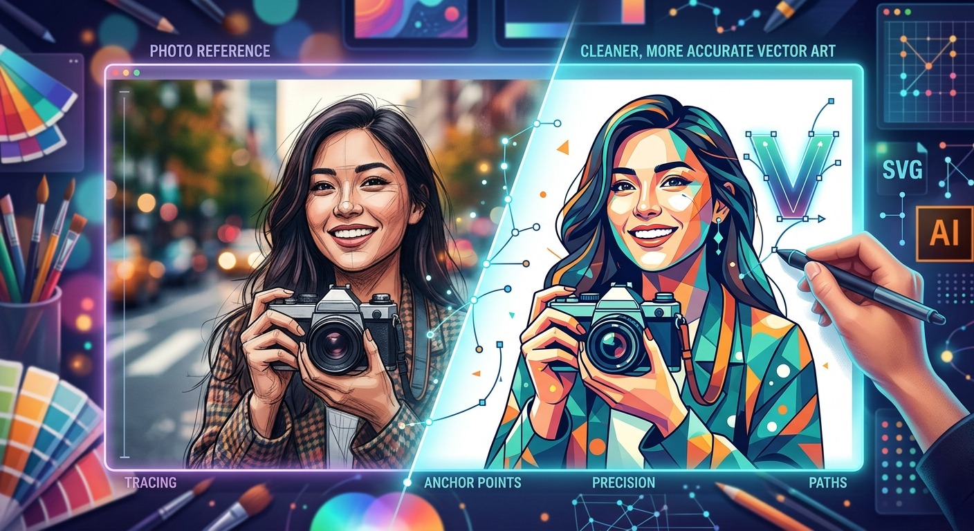
Most vector artists have been there. You sit down to build an illustration from memory, three hours pass, and the result has that vague quality of something imagined rather than observed. Proportions feel guessed. Fabric folds look invented. The hands are suspiciously hidden. Photo references fix all of that, not because they make your work mechanical, but because they give your instincts something real to push against.
The work you do before placing a single anchor point determines how smooth the build will be.
- Cropping and framing your reference photo before importing it saves significant rework and keeps your canvas clean.
- Isolating the subject from its background prevents you from accidentally tracing noise or distracting context into your paths.
- A locked, low-opacity reference layer is the single most reliable setup for an accurate and focused vector build.
Why Photo References Change Your Results Immediately
There is a persistent myth in illustration circles that using references is a crutch. It is not. Every professional illustrator, concept artist, and character designer uses references. The difference between beginners and working professionals is not that professionals work from memory. It is that professionals know how to use references without becoming slaves to them.
For vector work specifically, references solve a problem unique to the medium. When you build from paths, you are making constant decisions about where to place anchor points, how to curve a handle, and where to simplify a shape. Without a reference, those decisions are based entirely on your internal model of the subject. That internal model is almost always slightly wrong, especially for complex organic subjects like figures, animals, or foliage.
A reference does not need to match your final illustration exactly. It needs to give you enough accurate information to make good decisions. That is the whole point of the preparation phase.
Finding Reference Photos That Actually Work
Not every photo makes a useful reference. A technically correct photograph can still be a poor reference for vector art if the lighting is too flat, the subject is buried in a complex background, or the angle does not match the perspective your illustration needs.
The best reference photos for vector work tend to share a few qualities. They have clear, readable silhouettes. They show enough shadow and highlight to define form without excessive texture noise. And they match the general composition you have already planned or roughly sketched out.
For sourcing, you have several solid options depending on the project. Your own photography gives you complete control over angle, lighting, and subject matter. Stock photo libraries work well for subjects you cannot photograph yourself. For stylized or character-based work, pulling from multiple references, each covering a different element of the final piece, often produces better results than a single catch-all photo.
When choosing between multiple candidate images, prioritize the one where the key shapes in your illustration read most clearly at a glance. Clean silhouettes beat detailed textures every time for a vector workflow.
Cropping and Framing Your Subject Before You Import
This step gets skipped more often than it should. Artists download a reference, drag it straight into Illustrator or Inkscape, and start building. Then they spend the next thirty minutes squinting past irrelevant background content, accidentally tracing edges that do not belong, or fighting a canvas full of visual noise that has nothing to do with their illustration.
Crop your reference first. Get the framing right before the file ever touches your vector tool.
What you are looking for at this stage is a clean, tight frame around the element you actually need. If you are building an illustration of a bird perched on a branch, you do not need the sky, the fence, the blurry foliage at the bottom, or the edge of a stranger’s shoulder at the frame corner. You need the bird and enough of the branch to understand the contact point between them.
Getting that crop right before you import means your reference layer is immediately useful the moment it lands in your workspace. Using an image cropper at this stage lets you trim the photo precisely, adjusting aspect ratio and composition so the framing matches your artboard before a single anchor point is placed. That alignment between your reference and your working canvas pays off throughout the entire build.
Think about composition framing here too, not just subject isolation. If your final illustration will have the subject centered with breathing room on both sides, set your crop to roughly mirror that. It makes the import feel intentional, and it keeps your reference and your developing illustration spatially in sync from the start.
Setting Up a Clean Reference Layer in Illustrator and Inkscape
Once your reference photo is cropped and ready, the layer setup inside your vector tool is straightforward. Doing it properly makes the build noticeably smoother. Here is the setup process that works reliably in both Illustrator and Inkscape:
- Create a dedicated layer at the bottom of your layer stack. Name it something obvious like “REF” or “PHOTO” so there is no ambiguity later.
- Place or import your cropped reference photo onto that layer and align it to your artboard.
- Reduce the layer opacity to around 40 to 60 percent. You want the reference visible but not competing visually with your paths.
- Lock the reference layer immediately. This prevents accidental selection, movement, or modification while you build above it.
- Create a new, unlocked layer above the reference for your actual vector work. This is the only layer you should be drawing on.
That five-step setup sounds simple because it is. But it is also the exact foundation that prevents the small, frustrating accidents that slow builds down. A locked reference layer cannot be accidentally selected mid-draw. A slightly transparent reference remains readable without overpowering your developing paths. The clean separation between layers keeps your file organized from the first mark.
In Inkscape, the XML editor gives you additional control over layer properties if you need it. In Illustrator, the Layers panel handles everything above without needing to go further than the basics.
Translating Reference into Original, Expressive Vector Paths
This is where artistic judgment enters. Your reference is set up. Your layers are organized. Now you need to build paths that are accurate to the reference without becoming a mechanical copy of it.
The key is abstraction. Your job is not to trace every edge faithfully. Your job is to look at the reference, understand the essential shapes that make the subject recognizable, and build paths that express those shapes with clean, intentional curves.
Understanding how Bézier curves behave is central to this. Every curve in a vector illustration is defined by anchor points and handles. The fewest anchor points that accurately describe a shape will always produce the cleanest, most scalable path. That is the technical principle. The artistic principle is that slight, intentional deviations from the reference are exactly what give your illustration personality rather than just accuracy.
When building a curve that follows the edge of a shoulder or the arc of a petal, you are not trying to match every pixel of the photo. You are trying to capture the essential character of that curve in as few points as possible. The reference tells you what the curve does. Your judgment tells you how to express it.
A few practical habits that help at this stage:
- Toggle your reference layer’s visibility on and off regularly. Seeing your paths in isolation helps you spot areas where the illustration has drifted too far from the reference, or where it has become too dependent on it.
- Build major silhouette shapes first, internal detail shapes second. Get the large read right before adding structure inside it.
- Simplify aggressively. If a single smooth curve can replace three anchor points, use the single curve every time.
- Step back from your canvas periodically. Distance reveals proportion issues that close-range work consistently misses.
When to Depart from the Reference on Purpose
Photo references are not contracts. They are starting points.
There are moments in every illustration where the reference is technically accurate but artistically wrong for the piece you are building. A shadow falls in a way that breaks your color palette. A limb angle that reads clearly in the photograph looks stiff in your particular illustration style. A texture in the photo suggests complexity that would clutter your paths without adding any meaning to the final image.
In those moments, depart from the reference deliberately. This is not a failure of discipline. It is good artistic judgment. The reference was there to help you make informed decisions, and choosing to deviate from it is itself an informed decision. The confidence to do that comes from having built on a solid reference foundation in the first place.
Illustrator’s Image Trace feature offers a useful shortcut for getting rough paths from a photo quickly. Official image trace documentation walks through every available setting in detail. But even with automated tracing, understanding the reference and making conscious choices about where to follow it and where to diverge is what separates clean, professional output from mechanical results. Automated paths still need substantial cleanup, simplification, and artistic decisions before they reach a finished state.
From Preparation to Path, and Where Accuracy Becomes Art
The reason photo references improve vector art is not that they make drawing easier. They make every decision better. Each anchor point you place is a small judgment call about shape, proportion, and curve. When those calls are informed by careful observation of a well-prepared reference, they add up to something accurate and expressive. When they are made in a vacuum, they add up to something that just looks slightly off without anyone being able to say exactly why.
The preparation phase, sourcing a useful photo, cropping it to isolate exactly what you need, importing it cleanly into a locked reference layer, is where you set the conditions for a good build. Skip it and you are working harder for a weaker result. Do it properly and the actual building phase feels remarkably controlled.
References do not replace the artist. They inform the artist. The paths, the curves, the choices about abstraction and simplification, all of that belongs entirely to you. The reference just ensures that what you build is grounded in something true.