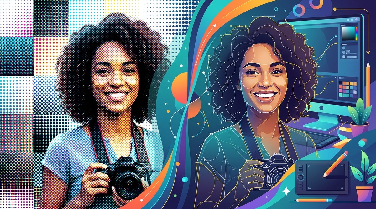
A portrait made of dots. A logo with that vintage newsprint texture. A t-shirt design that feels like a screen print from the 1960s. That look is a halftone, and for years, getting it right meant opening Photoshop, converting your image to grayscale, and accepting a pixel based result. But what if you could build those dots entirely in vectors? No raster files. No resolution limits. Just clean, scalable paths that look sharp on a business card or a billboard.
That is exactly what this vector halftone tutorial covers. We will walk through the process of creating a pure vector halftone effect using Adobe Illustrator. By the end, you will know how to simulate photographic tones using nothing but circles, lines, and smart Illustrator tools.
A vector halftone lets you mimic continuous tone photography without a single raster pixel. You control dot size, spacing, and shape using Illustrator’s native tools. The result stays editable and infinitely scalable. This technique is perfect for screen printing, merch design, and branding projects where file size and resolution matter. Master it, and you unlock a classic look that never breaks when you resize it.
What Is a Vector Halftone, Exactly?
A halftone is a way to represent shades of gray using dots of varying size. In traditional print, a photograph gets broken into a grid of tiny dots. Darker areas have larger dots. Lighter areas have smaller dots or no dots at all.
A vector halftone does the same thing, but every dot is a vector object. That means no pixels, no resolution dependency, and no blurry edges when you scale the artwork up. You get the retro charm of a halftone with the technical benefits of vector art.
This is different from the halftone filter in Photoshop, which rasterizes your image and locks you into a specific resolution. With a vector approach, you can change your mind later. You can adjust dot density, swap colors, or resize the entire composition without losing quality.
Why Go Pure Vector?
There are a few solid reasons to keep your halftones in vector format.
- Scalability: A vector halftone looks identical at 1 inch and 10 feet wide.
- Print ready: Screen printers love vector files because they separate cleanly. No hidden raster layers to worry about.
- Editability: You can select individual dots, change their fill color, or adjust opacity. Try that with a pixel based halftone.
- Small file size: A vector halftone with hundreds of dots is often smaller than a medium resolution JPEG.
If you are designing for merchandise, branding, or any project that might need to scale, this approach saves you headaches later.
The Core Method: Manual or Automated?
There are two main paths to a vector halftone. You can build it manually by placing and scaling circles one by one, or you can use a semi-automated technique that leverages Illustrator’s pattern and symbol tools.
For this tutorial, we will focus on the semi-automated method. It gives you control without taking hours. Here is the high level process.
- Start with a grayscale image or a high contrast photograph.
- Use Illustrator to create a grid of circles that respond to the brightness values of the image.
- Convert that grid into a vector halftone pattern.
- Clean up and export.
Let us break that down step by step.
Step by Step: Building Your Vector Halftone
Step 1: Prepare Your Source Image
Open Adobe Illustrator and place your reference photo. It can be a portrait, a landscape, or a logo. Anything with a range of tones works.
Go to the Edit menu and choose Edit Colors, then Convert to Grayscale. This strips out color information and leaves you with luminance data. You do not need color for a traditional halftone.
If your image has very dark shadows and bright highlights, that is perfect. Halftones thrive on contrast.
Step 2: Create a Grid of Symbols
Draw a small circle. Make it about 10 points in diameter. Give it a black fill and no stroke. This is your base dot.
Open the Symbols panel (Window > Symbols). Drag your circle into the panel and choose Graphic as the symbol type. Name it “Halftone Dot.”
Now you have a symbol that you can place many times without inflating your file size. Each instance references the same master symbol.
Step 3: Build the Dot Array
Use the Symbol Sprayer tool from the toolbar. It looks like a spray can. Click and drag across your artboard to scatter copies of your halftone dot symbol. Do not worry about precision yet. You just want a dense field of dots covering the area where your image sits.
You can adjust the density by double clicking the Symbol Sprayer tool and changing the Density value. Start around 5 or 6 for a medium grain.
Step 4: Map Dots to Image Brightness
Here is where the magic happens. Select the entire group of symbol instances. With the group selected, open the Transparency panel (Window > Transparency). Click the Make Mask button at the bottom of the panel.
A white thumbnail appears next to your artwork. This is the mask. Click the mask thumbnail to enter mask editing mode.
Now paste a copy of your grayscale image directly into the mask. The mask uses brightness to control transparency. White areas of the mask keep the dots fully visible. Black areas hide them. Gray areas make them partially transparent.
The result is a vector halftone where dot density appears to vary based on the tones of your image. The dots themselves are still there, but the mask reveals or hides them.
Step 5: Refine and Expand
If you want true dot size variation instead of just on/off visibility, you have a couple of options.
One approach is to use the Transform effect. Select the symbol instances and go to Effect > Distort & Transform > Transform. Add a scale value tied to the brightness of the underlying mask. This requires a bit of trial and error, but it can produce a more organic halftone.
A simpler method is to manually adjust dot sizes in key areas. Select individual symbols and change their size in the Transform panel. This is more work, but it gives you complete control.
For most projects, the mask method produces a convincing vector halftone with minimal effort.
Common Mistakes to Avoid
Even experienced designers trip up on a few things when making vector halftones. Here is a table of techniques and pitfalls.
| Technique | What It Does | Common Mistake |
|---|---|---|
| Symbol Sprayer | Places many dot instances quickly | Overcrowding the artboard with too high density |
| Opacity Mask | Controls visibility based on brightness | Forgetting to lock the mask before editing artwork |
| Grayscale conversion | Removes color data for accurate tone mapping | Skipping this step and getting muddy results |
| Manual dot scaling | Adjusts individual dot sizes | Spending too much time on tiny details that do not show at print scale |
| Expand appearance | Converts effects to editable paths | Applying this too early and losing the ability to tweak |
Expert advice: Do not expand your symbols until you are absolutely sure the halftone is final. Once you expand, each dot becomes an individual path, and your file size can balloon. Keep it symbolic for as long as possible.
When to Use a Vector Halftone
This technique fits specific design scenarios really well.
- Screen printed t-shirts: Printers prefer vector halftones because they separate easily into spot colors.
- Posters and flyers: The retro dot texture adds character to event posters or album art.
- Logo treatments: A halftone effect can give a brand a vintage, handcrafted feel.
- Merchandise: Hats, bags, and stickers all benefit from the scalability of vector art.
If your project needs photographic realism at a massive scale, a vector halftone might not be the best choice. It works best as a stylistic effect, not a substitute for high resolution photography.
Tools and Shortcuts to Speed Up Your Workflow
Illustrator has a few features that make vector halftone creation faster.
- Symbols panel: Use it to store your base dot. Any change to the symbol updates all instances.
- Opacity masks: They are the backbone of this technique. Learn the keyboard shortcut (Cmd+7 on Mac, Ctrl+7 on Windows) to create a clipping mask, but remember that an opacity mask is different. Check the Transparency panel.
- Global edit: Double click a symbol instance to edit the master. All instances update in real time.
For more on building efficient workflows, check out our guide on 5 vector art workflow hacks to speed up your design process in 2026. It covers time saving techniques that apply to any vector project.
Taking It Further: Custom Dot Shapes
Circles are classic, but you are not limited to them. Try using squares, diamonds, or even custom shapes as your halftone dot. The process is the same. Create a symbol of your shape, spray it across the artboard, and apply the opacity mask.
Different shapes produce different textures. Diamonds give a more angular, almost woven look. Squares mimic a digital bitmap aesthetic. Experiment to find the right feel for your project.
If you want to see how other designers are pushing vector art forward, take a look at our showcase of innovative vector artists shaping the future of digital design. It is full of inspiration for your next halftone piece.
Wrapping Up Your Vector Halftone Project
A vector halftone is one of those techniques that looks complicated but becomes second nature after a few tries. The key is to let Illustrator’s mask system do the heavy lifting. You focus on the image selection and the dot density, and the software handles the mapping.
Start with a high contrast photo. Build a clean symbol. Spray it generously. Apply the mask. Then step back and look at the result. If the dots feel too dense or too sparse, adjust the symbol size or the spray density and try again.
This is not a one click filter. It takes a little patience. But the result is a fully vector, infinitely scalable halftone that you can drop into any project without worrying about resolution. That is a skill worth adding to your toolbox.
Now go open Illustrator and try it. Pick a portrait of someone you know. Build the halftone. See how the dots shape the face. It is satisfying every single time.