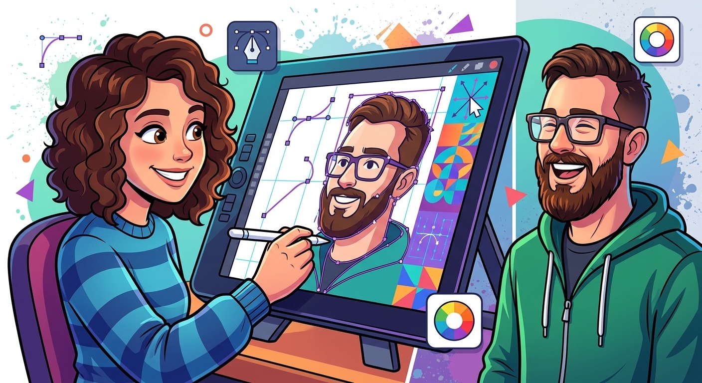
There is a specific kind of frustration that hits when you finish a cartoon portrait commission and the client replies with “it’s cute, but it doesn’t really look like me.” You spent hours pushing Bezier handles around. The style is solid. The colors are clean. But the face drifted away from reality somewhere between the reference photo and the artboard. Getting likeness right in a cartoon vector portrait is the hardest skill in the discipline, and almost nobody addresses it directly.
Portrait-to-Vector Workflow: Key Points
- Lock in likeness from the photo reference before you simplify a single feature into vector paths.
- Use an AI preview tool to see how the face flattens into cartoon form before committing to the Illustrator build.
- Exaggeration should amplify what is already distinctive about a face, not replace it with a generic cartoon template.
Why Likeness Collapses the Moment You Start Simplifying
Cartoon portraits exist in tension. You need to reduce a face to its geometric essentials while keeping the identity of a real person intact. Push simplification too far and you end up with a face that could belong to anyone. Stay too literal and you lose the appeal of the cartoon form entirely.
The mistake most vector artists make is jumping straight into style. They pick a cartoon aesthetic they like, open Illustrator, and start placing shapes. The style takes over, and the actual face of the subject becomes a casualty. Likeness has to come first. Style is the layer that sits on top of it.
Think of likeness as a structural skeleton. The jaw angle, the distance between the eyes, the height of the forehead relative to the chin, the specific curve of the nose bridge. These proportions define a face more than any individual feature. If those spatial relationships are off, no amount of polish will make the portrait recognizable.
Reading the Reference Photo Before Touching Your Tools
Before you open a single application, spend time with your reference photo analytically. You are not looking at the face the way you would in conversation. You are measuring it.
Identify the dominant shapes first. Is the face round, oval, square, or heart-shaped? Look at the width of the forehead versus the jaw. Notice whether the eyes sit high or low within the face. Measure the gap between the lower lip and the chin. These are your anchor observations, the proportional facts that will keep the portrait grounded in reality no matter how stylized the final artwork gets.
Mark the features that make this specific face distinctive. A very wide mouth. A prominent brow ridge. A narrow chin. Eyes that sit deep in their sockets. A strong jaw. These are the details the brain uses for recognition, and they are exactly the features you will want to preserve or carefully exaggerate when you build your vector version.
Portrait and figure drawing traditions have long described the face as roughly five eye-widths across at its widest point, with consistent proportional ratios between the hairline, brow, nose base, and chin. Use these as a calibration baseline. When a cartoon portrait breaks those ratios, it needs to do so with intention, not by accident.
Using a Pre-Production Preview to See How the Face Will Simplify
Here is where many working artists add a step that saves real time. Before committing to the full Illustrator build, it is worth seeing how a face naturally translates into flat cartoon form. Running your reference through an AI cartoonizer gives you a fast pre-production preview of which features hold up under simplification and which ones blur together or disappear entirely.
This is not a shortcut to the finished artwork. Treat it as a diagnostic tool. The automated output shows you how software reads the face when forced to flatten it into cartoon geometry. Look at which features the algorithm preserves as dominant shapes. Notice where detail collapses. That output tells you where your eye needs to do the most careful work when you build the real thing by hand.
The preview also helps with client communication before you have invested hours. You can show a subject a rough stylized interpretation, set expectations around simplification level, and discuss how much of the realism they want retained. That conversation is far easier at the reference-prep stage than after you have already committed to a fully built vector portrait they do not connect with.
Building the Portrait Foundation in Illustrator
Once you have your reference analysis and your stylization preview in hand, you are ready to build. Start with the face outline. Place your reference photo on a locked layer at low opacity. Trace the outer silhouette of the head using a single compound path. Do not add detail yet. Get the overall head shape right first.
From there, block in the major feature zones as separate filled shapes. The eye socket area as one shape. The nose as another. The mouth region as its own form. At this stage you are still working structurally. Each blocked shape should sit in proportional relationship with the others the way they do in the reference photo.
Resist the urge to start adding style details. No highlights, no line weight variation, no stylized iris shapes. You are building the skeleton before you dress it. Check proportions constantly by toggling the reference photo visibility on and off. If the cartoon face and the real face share the same spatial logic, you are on track.
Cartoon Portrait Style Approaches by Complexity and Commercial Use
| Style Type | Anchor Complexity | Likeness Retention | Best Commercial Use |
|---|---|---|---|
| Flat Icon | Low | Moderate | App icons, profile avatars |
| Semi-Realistic Cartoon | Medium | High | Brand mascots, merch designs |
| Classic Caricature | High | Distinctive and amplified | Portrait commissions, prints |
| Geometric Simplified | Very Low | Low to Moderate | Logo integration, branded merch |
Exaggeration That Amplifies Rather Than Replaces
Once your foundation is structurally accurate, you have earned the right to exaggerate. Cartoon exaggeration is not about randomly distorting features. It is about amplifying what is already present. The caricature tradition has always operated on this principle: identify the most dominant feature and make it more itself. A wide smile becomes wider. Deep-set eyes become deeper. A strong chin gets stronger. You are not inventing a new face. You are turning the volume up on the existing one.
Proportion governs how far you can push this. When you exaggerate one feature, the surrounding features need to respond to maintain coherence. If you stretch the jaw downward to accommodate an exaggerated chin, the rest of the face shifts slightly to keep the whole composition reading as a face rather than a collection of unrelated shapes. This is precisely why understanding the reference deeply before you start pays off. You need to know the face well enough to understand which direction to push each feature and by how much.
For most cartoon portrait commissions, keep exaggeration subtle unless the client has specifically requested something more extreme. The goal is for the subject to look at the portrait and feel flattered and recognized. Save the heavy distortion for editorial work and caricature commissions where that register is expected and explicitly part of the brief.
Anchor Points and Path Discipline for Clean Vector Builds
The technical quality of a cartoon vector portrait lives entirely in how you handle anchor points. Too many points on a curve and the path becomes rigid and lumpy. Too few and you lose the nuance of natural facial curves. The rule is to use the minimum number of anchor points necessary to describe the curve accurately.
For smooth facial curves, use symmetrical Bezier handles wherever the shape calls for it. The handles on either side of an anchor should be equal in length and opposite in direction for smooth, continuous transitions. Break that symmetry only where you actually need a sharp change of direction, such as the inner corner of an eye or the cupid’s bow of an upper lip.
Organic shapes like jawlines, cheek curves, and forehead lines are where beginners consistently over-anchor. They click too frequently while trying to track the shape manually, and the result is a bumpy outline scattered with dozens of unnecessary points. Try placing fewer anchors and adjusting handle lengths instead. A jaw can usually be described with three or four well-placed points. The Pen tool in Illustrator rewards patience. Place each anchor deliberately, adjust its handles before adding the next point, and work continuously around the shape rather than jumping between areas. That workflow produces paths that need far less cleanup at the end.
Path Cleanup and Print-Ready File Delivery
A cartoon portrait that looks great on screen can fall apart in print if the underlying paths are messy. Before calling a portrait finished, run a path audit. Check for overlapping shapes that compound unnecessarily. Use Object, Path, Simplify in Illustrator to reduce redundant anchor points without visibly changing the shape. This step alone can cut point counts significantly and produce smoother output at print sizes.
Color fills should be solid and closed. Open paths in a print file can produce unexpected results depending on the RIP software a print shop uses. Close every path explicitly. If you used opacity or transparency effects for shadows and highlights, expand those appearances before handing off the final file. What looks clean in screen preview can behave unpredictably when processed by industrial print equipment.
Flatten swatches to global colors if the portrait is destined for screen printing or embroidery, where color count directly affects cost. Label layers clearly and group related elements logically. The face shape and skin fill together. Hair shapes grouped. Feature details in their own layer group. A well-organized file communicates professionalism immediately and makes any future edits far faster, whether those edits come from you or from the client themselves.
Artboard size matters for print delivery. Set up at the actual output dimensions from the start, or at a scale that divides evenly from the intended print size. Vector files scale without quality loss, but setting up at thumbnail dimensions and delivering at poster size can expose proportion issues that were invisible at small scale. Build at real output size from the beginning and those surprises disappear.
When the Face on the Artboard Finally Looks Like the Real Person
There is a specific moment in building a cartoon portrait when the face clicks into recognition. You have the proportions right. The exaggeration is calibrated. The paths are clean and deliberate. The subject looks at it and immediately sees themselves. That moment is what the entire workflow is built to produce.
It does not happen by accident. It happens because you spent time with the reference before touching any tool. You mapped the face. You previewed how it would simplify. You built structure before style. You exaggerated with intention rather than habit or guesswork.
That process is what separates cartoon portrait work that earns repeat commissions from work that looks technically polished but fails to connect. Clients come back when the portrait genuinely looks like them. They share it widely when they love it. They pay more for it when they trust that the artist will get it right every time. The technical workflow is not just about craft. It is the foundation of a sustainable, referral-driven commission practice built on portraits that actually look like the people in them.