You’ve spent hours perfecting your logo, your color palette, and your mission statement. Everything feels right. But when you try to use that logo on a billboard, it looks blurry. On a business card, it’s too tiny to read. Sound familiar? That’s the moment many small business owners realize their brand identity is built on shaky ground. The culprit is often the file format hiding behind the scenes.
Vector art might be the fix you are looking for. Unlike pixel-based images that stretch and distort, vector graphics use mathematical paths. They stay crisp at any size. But vector art is not a magic bullet for every brand. Let’s walk through what makes it different, when it works best, and how to decide if it fits your brand identity in 2026.
Vector art gives your brand identity unmatched scalability, consistency across all media, and easy color editing. However, it requires a skilled designer or the right tools. For logos, icons, and promotional materials, vector is the gold standard. Raster images still win for complex textures and photography. Match your choice to your core brand assets.
What Makes Vector Art Different from Raster
Most people think of digital art as a grid of tiny squares called pixels. That’s a raster image. A photograph from your phone, a JPEG on your website, a PNG with a transparent background. These files are made of fixed dots. When you enlarge them, the dots spread apart and the image turns into a blurry mess.
Vector art takes a completely different approach. Instead of pixels, it stores shapes as formulas. A circle is not a bunch of dots. It’s a center point, a radius, and a stroke thickness. This means you can scale a vector graphic to the size of a billboard or a postage stamp without losing any quality. For brand identity, this is a game changer.
Here’s a side-by-side comparison of what each format gives you.
| Aspect | Vector Art | Raster Art |
|---|---|---|
| Scalability | Infinite, no quality loss | Limited, becomes blurry or pixelated |
| File size | Small and efficient | Large at high resolutions |
| Editability | Easy to change colors, shapes, text | Difficult; involves repainting pixels |
| Best use | Logos, icons, illustrations, typography | Photos, complex gradients, textures |
| Common formats | SVG, AI, EPS, PDF | JPEG, PNG, GIF, TIFF |
When Vector Art Makes Sense for Your Brand
Vector art brand identity is a natural fit for the core assets of any small business. Your logo, your social media icons, your website header, your product labels. These elements need to appear on everything from a phone screen to a delivery truck. If they are not in vector format, you will run into quality problems every time you resize them.
Consider these scenarios where vector art shines.
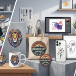
- Your logo appears on merchandise. Think t-shirts, mugs, and hats. Print shops prefer vector files because they can scale them cleanly and separate colors for screen printing.
- You need a responsive website. Vector icons and illustrations load fast and adapt to any screen size without looking fuzzy on retina displays.
- You plan to grow. A vector logo can be reused for decades without becoming outdated. It stays crisp as your brand expands into new mediums.
- You want to keep costs low. Vector files are small. They save bandwidth and storage. Plus, you can tweak colors yourself with minimal software.
If your brand relies heavily on photographs or realistic images, vector alone won’t cut it. But most brand identities blend both. A vector logo paired with raster product shots gives you the best of both worlds.
Common Mistakes That Ruin a Vector Brand Identity
Even if you choose vector art, mistakes happen. These are the most frequent pitfalls small business owners encounter.
- Using a raster file and calling it vector. Someone saves a JPEG as a .ai file. That does nothing. It’s still a pixel image in a new wrapper. Always start with true vector artwork.
- Ignoring color profiles. Vector files can carry RGB or CMYK color data. If you use RGB for print, the colors might shift. Ask your designer to set the correct profile from the beginning.
- Skipping font outlines. If you send a vector file with live text to a printer who doesn’t have your font, the layout will break. Convert text to outlines (curves) before sharing.
- Overcomplicating the design. Too many paths, gradients, and effects make vector files heavy and hard to edit. Keep your brand marks simple. They will perform better across all uses.
Here’s a table that shows the right and wrong approach for common brand assets.
| Asset | Right Move | Wrong Move |
|---|---|---|
| Logo | Create vector shapes, limit colors | Use a scanned drawing or low-res PNG |
| Business card | Export vector PDF for print | Export a JPG and hope it prints cleanly |
| Social media icons | Upload SVG or high-res PNG from vector source | Upload a tiny cropped image |
| Email signature | Use a tiny inline SVG or PNG at 100% | Use a full-resolution vector (breaks email clients) |
“A brand identity is only as strong as its smallest application. If your logo breaks on a favicon or a pen, you have a system failure. Vector art ensures that every touchpoint stays consistent.”
– Marisol Vega, brand identity designer and vector specialist
How to Build a Vector Art Brand Identity That Works
You don’t need to be a professional designer to get started. But you do need a clear process. Here is a practical five-step method for small business owners.
- Audit your existing brand assets. Gather every file you currently use: logo, icon set, business card template, website images. Note which ones are vector and which are raster.
- Identify the essential brand marks. Focus on the logo, secondary mark, and a small icon set. These are the files that must be vector for consistency.
- Choose a vector tool or hire a pro. If you have design skills, tools like Adobe Illustrator or Affinity Designer work well. For most small businesses, hiring a vector artist is faster and cleaner. Check out this guide on how to craft unique vector art for brand identity in 2026.
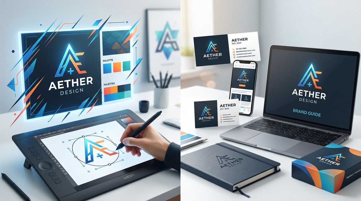
- Set up a master file with guidelines. Include exact colors (hex, CMYK, RGB), minimum size, clear space, and acceptable variations. This file becomes your single source of truth.
- Export all needed formats. From the vector master, generate PNGs at multiple sizes, a high-res JPEG for web, a PDF for print, and an SVG for digital use.
Once your system is in place, you can consistently produce professional-branded materials without reinventing the wheel each time.
The Real Cost of Choosing Wrong
Some small business owners try to save money by using a free logo maker that only outputs raster files. That seems fine at first. But a year later, when you need to print banners for a trade show, the logo looks terrible. The printer charges you extra to recreate it. Your brand loses credibility.
Vector art may involve an upfront investment in design or software, but it pays off every time you resize, repurpose, or reproduce your brand. If you are curious about the latest tools, the article on 10 vector art tools every designer should master by 2026 covers affordable options for beginners.
Another hidden cost is time. Editing a raster logo for a new campaign can take hours of pixel pushing. Editing a vector logo takes seconds. You change the fill color, update the stroke, and export. Done.
Vector Art Brand Identity in 2026
The design landscape keeps shifting. More brands are using animated logos, interactive websites, and responsive layouts. Vector art is the backbone of all those trends. SVGs can be animated with CSS or JavaScript. They can change color based on user interaction. They look great on any screen.
In 2026, the demand for consistent brand experiences across devices is higher than ever. A vector-first approach gives you flexibility that raster simply cannot match. If you pair vector art with thoughtful design, your brand identity will feel polished and professional from day one.
To see how other small businesses turn vector art into a complete identity, the resource on why vector art is the backbone of modern branding in 2026 shares real-world examples.
Trust Your Brand to the Right Format
You don’t have to become a vector expert overnight. Start with the logo. Get that one file converted to a clean, organized vector. Then build from there. Your future self, and your customers, will thank you for not settling for blurry pixels.
Take a look at your current brand files. If your logo looks fuzzy on a large screen or prints poorly, now is the moment to switch. Vector art is not just for big corporations. It’s for any business that wants its identity to look sharp, consistent, and ready to grow.