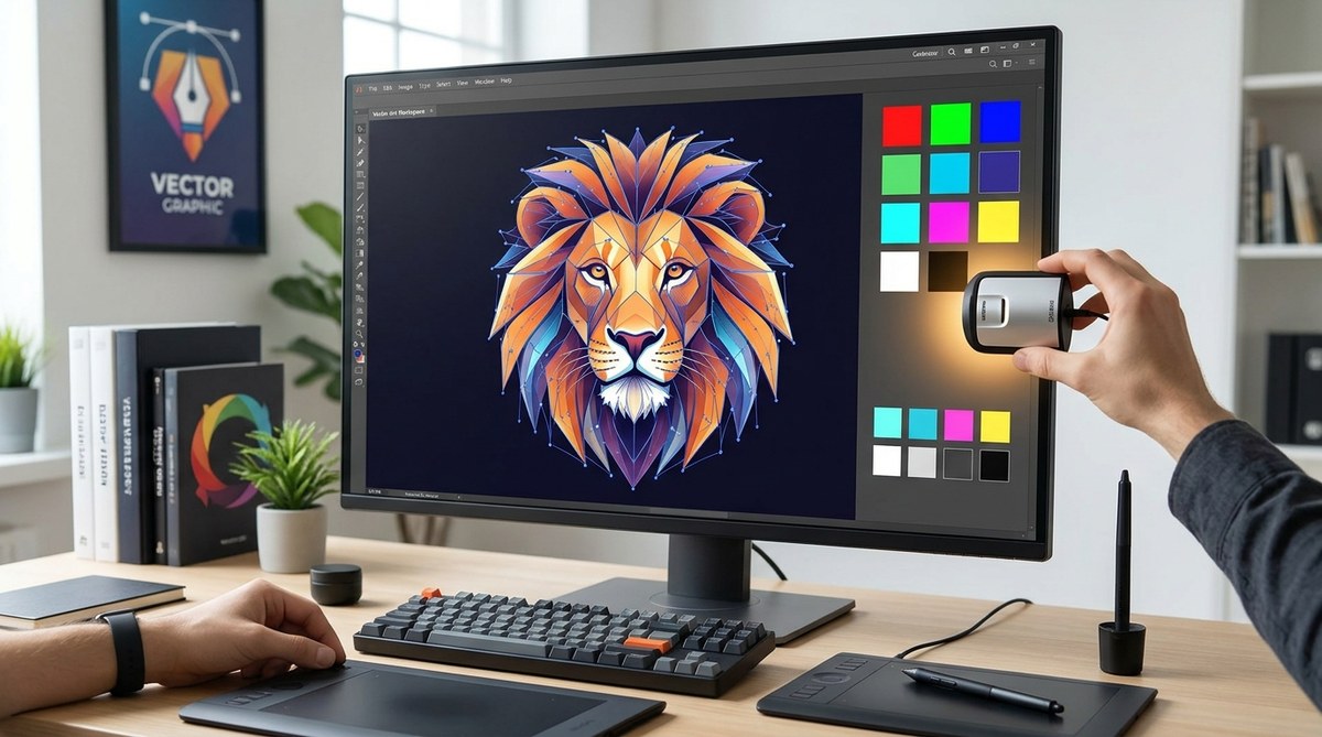
You open Adobe Illustrator to finalize a client logo. The rich blue you carefully selected on screen prints as a dull, muddy purple. The client is unhappy, and you are left wondering where things went wrong. The culprit is almost always your monitor. Vector art is built on precision, and that precision relies entirely on your ability to trust what you see. If your screen is not calibrated, your color choices are a gamble. This guide covers the best monitor calibration for vector art in 2026, so your work stays accurate from pixel to print.
The best monitor calibration for vector art in 2026 combines a hardware calibrator, a color-accurate IPS monitor, and a standard color space like sRGB or DCI-P3. Calibration is not a one-time event. You should recalibrate every three to four weeks to maintain consistency for client proofs, print outputs, and screen-based vector work.
Why Vector Art Demands Accurate Color
Vector art is not like photography. You are building shapes, paths, and fills with absolute numerical values. A logo uses a specific hex code or CMYK mix. When you apply a gradient in Affinity Designer, you expect it to render exactly as intended. An uncalibrated monitor shifts those values. A screen that is too warm makes yellows look orange. A screen that is too cool turns grays into blue tones. For a designer creating brand assets, that mismatch is a disaster.
Clients review your work on their own devices. If your monitor is off, you will spend hours sending revised proofs. The time you lose on color corrections adds up fast. Calibration solves this by setting your display to a known baseline. It removes the guesswork.
What to Look for in a Calibration Setup
Not all monitors are equal. A standard laptop screen will never match a dedicated design display. Here are the core specs you need for vector work.
- IPS panel technology: IPS panels offer wide viewing angles and consistent color across the screen. TN panels shift color when you tilt your head.
- High color gamut coverage: Look for 100% sRGB coverage at minimum. If you work in print, aim for 95% or higher DCI-P3 coverage.
- Hardware calibration support: Some monitors let you store calibration profiles directly on the screen. This keeps your settings intact even when you switch computers.
- Sufficient brightness: A peak brightness of 250 to 300 nits is comfortable for indoor studio work. Higher values matter more for HDR content.
The Calibration Process in 5 Steps
Calibration sounds technical, but it is straightforward. You need a hardware calibrator like a Datacolor Spyder or X-Rite i1Display Pro. Software-only adjustments are not accurate enough for professional vector art.
- Warm up your monitor. Let your screen run for at least 30 minutes before calibrating. This stabilizes the backlight.
- Set your target standards. For vector art intended for web or social media, use sRGB with a gamma of 2.2. For print, use DCI-P3 or Adobe RGB with a D65 white point.
- Run the calibrator. Place the device on your screen and follow the software prompts. It will measure your display and create a custom color profile.
- Save the profile. Name it with the date. This helps you track when you last calibrated.
- Verify with test images. Open a known reference image, like a color chart or a vector file you have printed before. Confirm it looks correct.
Common Mistakes and How to Avoid Them
Even experienced designers slip up. Here is a table of frequent calibration errors and the fixes.
| Mistake | Why It Hurts Your Vector Work | The Fix |
|---|---|---|
| Using software-only calibration | Profiles are generic and do not account for your specific panel. | Invest in a hardware calibrator. |
| Calibrating once and forgetting | Monitor backlights drift over time. | Set a recurring calendar reminder every three to four weeks. |
| Ignoring ambient light | Bright room light changes how you perceive color. | Use a hood or calibrate in your typical workspace lighting. |
| Not updating your graphics driver | Outdated drivers can override your calibration profile. | Keep your GPU drivers current. |
| Skipping the warm-up phase | Cold monitors display inaccurate colors. | Let the screen run for 30 minutes before calibrating. |
Picking the Right Color Space for Your Work
Your choice of color space depends on where your vector art will live.
- sRGB: The standard for the web. Use this for social media graphics, website assets, and digital portfolios. Most client devices expect sRGB.
- Adobe RGB: A wider gamut that is better for print. If you design packaging or high-end print collateral, this space gives you richer greens and reds.
- DCI-P3: Common in modern displays and some print workflows. It sits between sRGB and Adobe RGB. It is a good middle ground if you do both web and print.
For most vector artists, sRGB with a gamma of 2.2 is the safest starting point. You can always convert to a different space for final export.
“Your monitor is the window between your ideas and the final output. If that window is dirty, even the cleanest vector path will look wrong. Calibration is not optional. It is the foundation of professional work.” — Senior designer at a major branding agency.
Matching Your Monitor to Your Software
Adobe Illustrator and Affinity Designer both rely on your system’s color management. After calibration, ensure your software uses the correct profile.
- In Illustrator, go to Edit > Color Settings. Set your working space to sRGB or your chosen profile. Enable “Ask When Pasting” to avoid accidental mismatches.
- In Affinity Designer, navigate to Edit > Preferences > Color. Set the default RGB profile to match your calibrated space. Turn on “Use Hardware Acceleration” for smoother rendering.
If your software is set to a different profile, your calibrated monitor will not help. The two must align.
How Often Should You Recalibrate?
Monitor backlights change over time. A brand new screen might hold its calibration for a month. An older panel may drift after two weeks. A good rule is to calibrate at the start of every major project. If you work on multiple client jobs each month, set a recurring task for the first Monday of every month. This habit keeps your colors consistent and reduces the chance of a print disaster.
The Cost of Skipping Calibration
Let us look at a real scenario. You design a set of vector icons for a mobile app. You choose a specific shade of teal. The developer implements the icons, but on their screen, the teal looks greenish. The developer adjusts the color without telling you. The final app ships with mismatched branding. The client notices. You lose credibility.
That situation is avoidable. Calibration costs less than a single hour of your time and a few hundred dollars for a decent calibrator. The return on that investment is trust. Clients who know your colors are accurate will come back.
Putting It All Together in Your Workflow
Integrate calibration into your regular studio routine. Here is how to make it stick.
- Buy a hardware calibrator. The Datacolor Spyder X2 is a solid choice for most designers. The X-Rite i1Display Pro is the industry standard for high-end print work.
- Set a recurring calendar event. Label it “Monitor Calibration.” Block 45 minutes.
- Create a calibration log. Note the date, the profile name, and any changes to your workspace lighting. This helps you spot patterns.
- Double-check before client handoffs. Before you export a final vector file, open a known reference image and confirm it looks correct on your calibrated screen.
If you want to build a more complete toolkit, check out our guide on mastering vector art techniques for stunning digital creations to pair accurate color with strong design skills.
Your Monitor Is Your Most Important Tool
You spend hours perfecting anchor points, curves, and gradients. Do not let an uncalibrated screen undo that work. The best monitor calibration for vector art is the one you actually use. Pick a standard, get a hardware calibrator, and stick to a schedule. Your clients will notice the difference, and you will save yourself from frustrating revisions. Start today. Calibrate your monitor, update your software settings, and enjoy the confidence of knowing your colors are true.