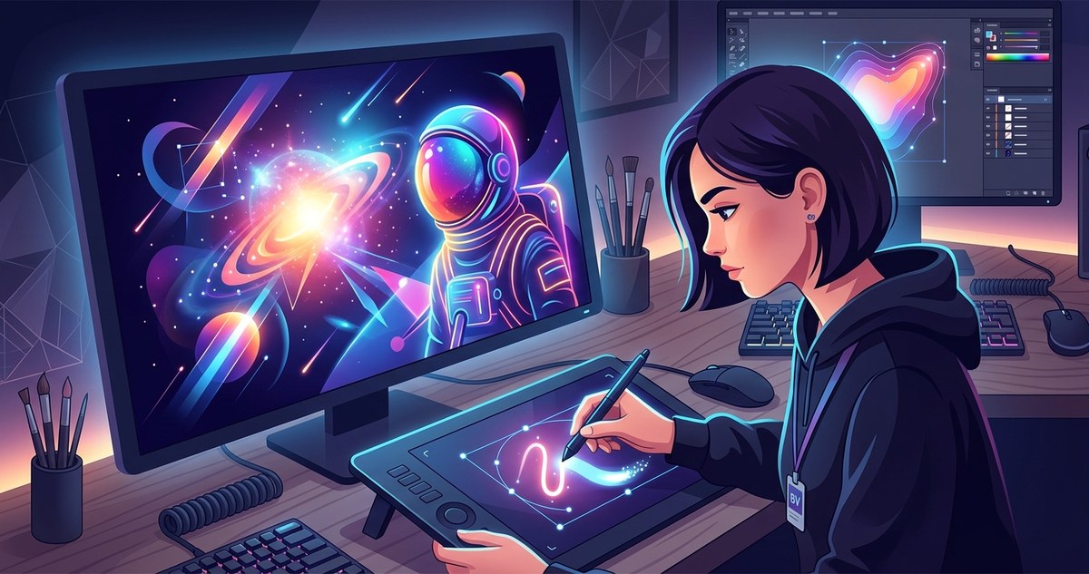
That soft, radiant glow you see in vector portraits, sci-fi posters, and modern logos isn’t magic. It is a deliberate set of techniques that any designer can learn. Whether you work in Adobe Illustrator or Affinity Designer, the vector art glow effect relies on layered transparency, blurred gradients, and smart use of blend modes. The result looks complex, but the process is surprisingly straightforward. Let’s walk through exactly how to build that luminous look from scratch.
The vector art glow effect is built from three core layers: a solid base shape, a soft blurred copy behind it, and a transparent highlight in front. By controlling opacity, Gaussian Blur, and blend modes like Screen or Overlay, you can create a convincing neon or ethereal glow without any raster textures. Practice with simple shapes first, then apply the method to any vector artwork.
Why the Glow Effect Feels So Satisfying
Our eyes are drawn to light. In vector art, a glow suggests energy, depth, or a digital “alive” quality. Think of the backlit edges on a character in a video game, the halo around a neon sign, or the subtle radiance on a product mockup. That glow makes flat shapes feel dimensional.
The best part? You do not need special plugins. The tools are already inside your software. You just need to know where to put the blur and how to stack your layers.
The Core Technique: Three Layers of Light
Every successful vector glow uses the same structural approach. Here is the breakdown:
- Base shape — This is the actual object you want to glow. It has a solid fill color, no stroke, and sits on top of your composition.
- Glow halo — Duplicate the base shape, move it behind the original, and apply a Gaussian Blur. Set its opacity lower than the base. This creates the soft spread of light.
- Highlight core — Duplicate the base shape again, place it in front, and set its fill to a lighter tint or white. Reduce opacity to around 30-50%. This gives the center a bright, hot spot.
That is the skeleton. From here, you can adjust colors, blur radius, and blend modes to match your style.
Step-by-Step: Building a Glow in Adobe Illustrator
Let’s apply this with a simple circle. Imagine you want a glowing blue orb.
- Draw a circle with a solid blue fill. No stroke.
- Copy it (Ctrl+C) and paste in place (Ctrl+F). Send this copy behind the original (Ctrl+[ ).
- With the back copy selected, open the Appearance panel. Add a Gaussian Blur effect (Effect > Blur > Gaussian Blur). Start with a radius of 8-12 pixels. Lower the opacity of this layer to 50%.
- Copy the original shape again (Ctrl+C, Ctrl+F). Bring this copy to the front (Ctrl+Shift+] ). Change its fill to a very light blue or white. Set opacity to 40%.
- Adjust the blur radius until the glow looks natural. A larger radius creates a softer, more ambient glow. A smaller radius keeps the light tighter.
That’s it. You now have a glowing circle. The same steps work for letters, icons, or complex illustrations.
Adapting the Glow in Affinity Designer
Affinity Designer follows the same logic but uses slightly different menu names.
- Use the Gaussian Blur live filter from the Layer menu.
- The Transparency tool controls opacity and blend modes.
- For the highlight core, use the Screen blend mode on the topmost layer to create a bright, washed-out center.
Affinity’s live filters are non-destructive, which means you can tweak the blur radius any time without redoing your work.
Blend Modes That Make Glow Look Real
The right blend mode changes everything. Here is a table showing which modes work best for each layer of your glow.
| Layer | Recommended Blend Mode | Effect |
|---|---|---|
| Base shape | Normal | Solid color sits on top of the background |
| Glow halo (blurred) | Screen or Overlay | Lightens the area behind the base, mimics light bleed |
| Highlight core | Screen or Color Dodge | Creates a bright spot in the center of the glow |
| Background layer | Normal or Darken | Keeps the glow visible and prevents washout |
Pro tip: If your glow looks muddy, switch the halo layer to Screen mode. If your glow looks too harsh, reduce the opacity on the highlight core.
Common Mistakes and How to Fix Them
Even experienced designers hit snags with glow effects. Here are the most frequent issues and their solutions.
- Glow looks like a dirty smudge. You probably used a dark color for the halo. Always use the same color as the base or a lighter tint. Dark halos kill the glow.
- Edges are too sharp. Increase the blur radius. A glow needs soft edges. If the blur is too small, the shape still looks like a flat vector.
- The glow disappears on a light background. Add a subtle dark shadow behind the glow, or use a dark background. Glow effects rely on contrast.
- Too many layers slow down your file. Group your glow layers together. Turn off the highlight core until you need to export. This keeps your file manageable.
When to Use Each Glow Style
Not every project needs a big, soft halo. Here are three common glow styles and when to use them.
- Ambient glow — Large blur radius, low opacity. Great for magical auras, light bulbs, or background lighting.
- Neon glow — Tight blur radius, high contrast between the base and the halo. Use this for signage, cyberpunk art, or text effects.
- Edge glow — Apply the glow only along the edges of a shape using a stroke instead of a fill. This works well for sci-fi helmets, glowing swords, or product outlines.
The Role of Color in Glow Effects
Color choice directly impacts how “hot” or “cool” your glow feels. Warm colors like red, orange, and yellow read as fire, energy, or warning lights. Cool colors like cyan, blue, and purple feel digital, magical, or calm.
For a realistic glow, the base color should be the darkest version of that hue. The halo should be the same hue but lighter. The highlight core should be nearly white. This natural gradient from dark to light is what our brains interpret as light emitting from a surface.
A Quick Checklist for Your Next Glow Project
Before you finalize your vector art glow effect, run through this list.
- Base shape has no stroke and a solid fill.
- Glow halo is behind the base and blurred.
- Highlight core is in front and set to a lighter tint.
- Blend modes are set to Screen or Overlay for halo and core.
- Opacity values are balanced. Nothing should be at 100% except the base.
- Background offers enough contrast for the glow to read clearly.
How to Add Glow to Text and Logos
Text glows the same way shapes do. Type your word, convert it to outlines (Type > Create Outlines), and then apply the three-layer method. For logos, keep the glow subtle. A halo that is too wide can make the logo feel bulky. Stick to a small blur radius and use Screen mode to keep the logo crisp.
If you are building a brand identity, you might want to read more about how to craft unique vector art for brand identity in 2026. Glow effects can become a signature element of your visual style.
Taking Glow Further with Gradients
Once you master the basic glow, try adding a gradient to the halo. Instead of a solid color, use a radial gradient that fades from your glow color to transparent. This creates a more organic light falloff. In Illustrator, apply the gradient to the blurred copy. In Affinity Designer, use the Fill tool with a radial gradient and then apply the blur filter.
This technique is especially useful for light sources like lamps, fireballs, or magical orbs where the light intensity decreases naturally as it moves away from the source.
Why Vector Glow Beats Raster Glow
You might wonder why not just use a raster glow effect in Photoshop. Raster glows look great, but they are resolution-dependent. If you scale the artwork, the glow pixelates or softens unevenly. A vector glow stays crisp at any size. That is why it is the preferred method for logo design, merchandise, and large-format printing.
Vector glow also gives you total editability. You can change the color, blur radius, or opacity at any time without starting over. That flexibility is a lifesaver when a client asks for a last-minute color change.
Your Turn to Create Light
The vector art glow effect is one of those techniques that looks like a secret trick until you try it. Then you realize it is just smart layering. Start with a simple shape. Practice the three-layer method. Adjust the blur and opacity until it feels right. Once you have the muscle memory, apply it to your own illustrations, logos, or typography.
If you want to expand your skills further, check out mastering vector art techniques for stunning digital creations for more ways to elevate your work. The glow effect is just the beginning.
Light Is a Tool You Can Control
Understanding how to create a vector art glow effect gives you a new way to direct the viewer’s attention. Use it to highlight a focal point, add atmosphere, or give your work that polished, professional finish. The next time you see a glowing illustration online, you will know exactly how it was built. Now open your software, pick a shape, and make it shine.