You are an illustrator who wants every vector piece to feel rich and dimensional. The problem? Most tutorials push you toward raster images or Photoshop brushes. But you can build texture and depth using only vector tools. No bitmaps. No external textures. Just pure paths, points, and fills. This article shows five specific vector art techniques for adding depth and texture that keep your files clean, scalable, and fully editable.
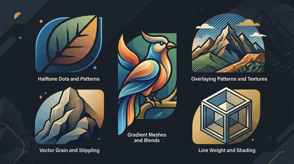
Adding depth and texture in pure vector art is possible with five core methods: gradient meshes create smooth transitions, overlapping semi-transparent shapes build layered depth, custom pattern brushes add repeating texture, mesh distortions warp surfaces organically, and blend modes with stacked shapes simulate soft shadows. Use these to keep your work fully vector while making it look rich and tactile. Practice each technique on simple shapes first.
Why Pure Vector Depth Matters in 2026
Vector art is everywhere. Logos, icons, editorial illustrations, even UI elements demand crisp lines and infinite scalability. But flat vectors can feel lifeless. Adding depth and texture makes your work stand out, especially when clients expect modern, dimensional styles without raster overhead.
Staying fully vector means your art is resolution-independent. You can scale it from a business card to a billboard without redoing anything. File sizes stay smaller. Edits are non-destructive. And you avoid the dreaded “linked image missing” error. These vector art techniques for depth and texture let you achieve that rich look while respecting the medium.
1. Gradient Meshes for Natural Transitions
Gradient meshes are your best friend for realistic shading. They let you control color at multiple points across a shape. Use them to simulate curved surfaces, lighting, and atmospheric depth.
How to start:
- Draw a basic shape. A circle works well for practice.
- Select the gradient mesh tool (U in Illustrator).
- Click inside the shape to add mesh lines. More lines mean more control.
- Click individual mesh points and assign colors.
- Adjust anchor handles to smooth transitions.
Example: Create a sphere that looks three-dimensional by placing a warm highlight in the upper left, a midtone in the center, and a cool shadow at the bottom right. The mesh handles the rest.
Pro tip: Keep your mesh density low at first. Too many points create a messy grid. Aim for 4 to 6 rows and columns for most organic objects.
2. Overlapping Shapes with Varying Opacity
Stacking shapes is the simplest way to add depth. Place one shape on top of another, reduce its opacity, and watch the layers blend.
Technique:
- Use the same hue but different brightness for each layer.
- Apply transparency in the Appearance panel.
- Experiment with blend modes: Multiply for shadows, Screen for highlights.
- Adjust opacity from 10% to 80% depending on the effect.
Real-world application: A forest scene. Draw a dark green tree. Duplicate it, move it slightly up and right, fill with a lighter green, set opacity to 40%. Repeat a third time with an even lighter shade at 20%. The result feels airy and dimensional.
3. Custom Pattern Brushes for Repetitive Texture
Want a textured surface like wood grain, fabric weave, or stippling? Build a custom pattern brush. Pattern brushes repeat a tile along a path. Unlike raster patterns, they remain vector and scale cleanly.
Steps to create one:
- Design a small tile (e.g., a set of dashes or dots).
- Open the Brushes panel, choose New Brush, then Pattern Brush.
- Set spacing, scaling, and flip options.
- Draw a path and apply the brush.
- Adjust stroke weight to control texture size.
Example: A crosshatch pattern brush. Draw a few diagonal lines, group them, and turn them into a pattern brush. Apply it to a filled shape’s stroke. The result looks like pencil shading without any raster trickery.
“Pattern brushes save hours of manual work. I use them for everything from leather texture to grass fields. The key is creating a tile that repeats seamlessly.” — Mikaela T., professional vector illustrator
4. Mesh Distortion for Organic Surface Warping
Mesh distortion lets you warp shapes using a grid. It’s perfect for adding irregular texture to flat areas, like wrinkles on fabric or ripples in water.
How to use it:
- Select the object you want to distort.
- Go to Object > Envelope Distort > Make with Mesh.
- Set a low row/column count (3 x 3 is often enough).
- Drag the mesh points to warp the shape.
- Combine with gradient meshes for extra depth.
Caution: Use this sparingly. Over-warping ruins the clean vector look. Try it on a highlight shape inside a larger object to give it a natural curve.
Common Mistakes and How to Fix Them
Here is a table that compares typical errors with the correct approach.
| Mistake | Why It Happens | Fix |
|---|---|---|
| Muddy colors after blending | Too many overlapping shapes with similar hues | Introduce contrast. Use complementary colors or adjust brightness values |
| Mesh grid looks chaotic | Too many mesh points | Start with fewer points. Add them only where needed |
| Pattern brush repeats visibly | Tile has obvious seams | Design tiles that wrap seamlessly. Use the Pattern Options panel |
| Shapes look flat despite layering | No variation in opacity or blend mode | Try different blend modes (e.g., Multiply for shadow). Reduce opacity to 30% or less |
| Distorted shape loses its original form | Too much warping | Keep mesh points gentle. Think of it as nudging, not punching |
5. Blend Modes and Stacked Shapes for Soft Shadows
Shadows add the final touch of depth. Instead of using Gaussian Blur (which creates raster), build shadows with stacked shapes and blend modes.
Method:
- Duplicate the object you want to shadow.
- Offset the duplicate slightly.
- Fill it with a dark color (like a deep brown or navy).
- Set blend mode to Multiply.
- Adjust opacity to 40–60%.
- Use the Shape Builder to cut away extra shadow parts.
For highlights: Use the same technique with a lighter color and Screen mode. Stack multiple layers for a soft glow.
Putting It All Together: A Workflow Example
Let’s create a simple illustration of a glass marble using only vector methods.
- Draw a circle for the base.
- Apply a gradient mesh with 3 rows and 3 columns. Make the center light blue, the edges dark navy.
- Add a smaller circle for the highlight. Fill it white, set opacity to 60%.
- Create a crescent shape for the inner shadow using a duplicate of the base. Move it down and right. Fill with black, multiply mode, opacity 30%.
- Add a thin crescent for a reflection. White, opacity 80%.
- Use a pattern brush on a small stroke to add a tiny dot texture on the surface.
The result: a shiny, glass-like marble with depth, texture, and zero raster elements.
Why These Techniques Work for Modern Vector Art
These vector art techniques for depth and texture rely on the core strengths of vector software: precision, scalability, and editability. They align with the growing demand for clean, lightweight assets in web and mobile design. By mastering them, you produce work that looks high-end without the clutter of linked raster files.
If you want to expand your skills further, check out our guide on mastering vector art techniques for more across-the-board advice. Also, stay updated with the top trends in vector artwork that are shaping 2026.
The Next Step for Your Vector Work
Pick one of these methods today. Start simple. Draw a sphere using gradient meshes. Then stack a shadow. Then add a pattern brush to the edge. You will feel the difference in your art immediately. Your files stay vector, your style gains dimension, and your confidence grows.
Vector art is powerful. You already have all the tools. Now use them to build worlds of depth and texture without ever leaving the safety of paths and points.