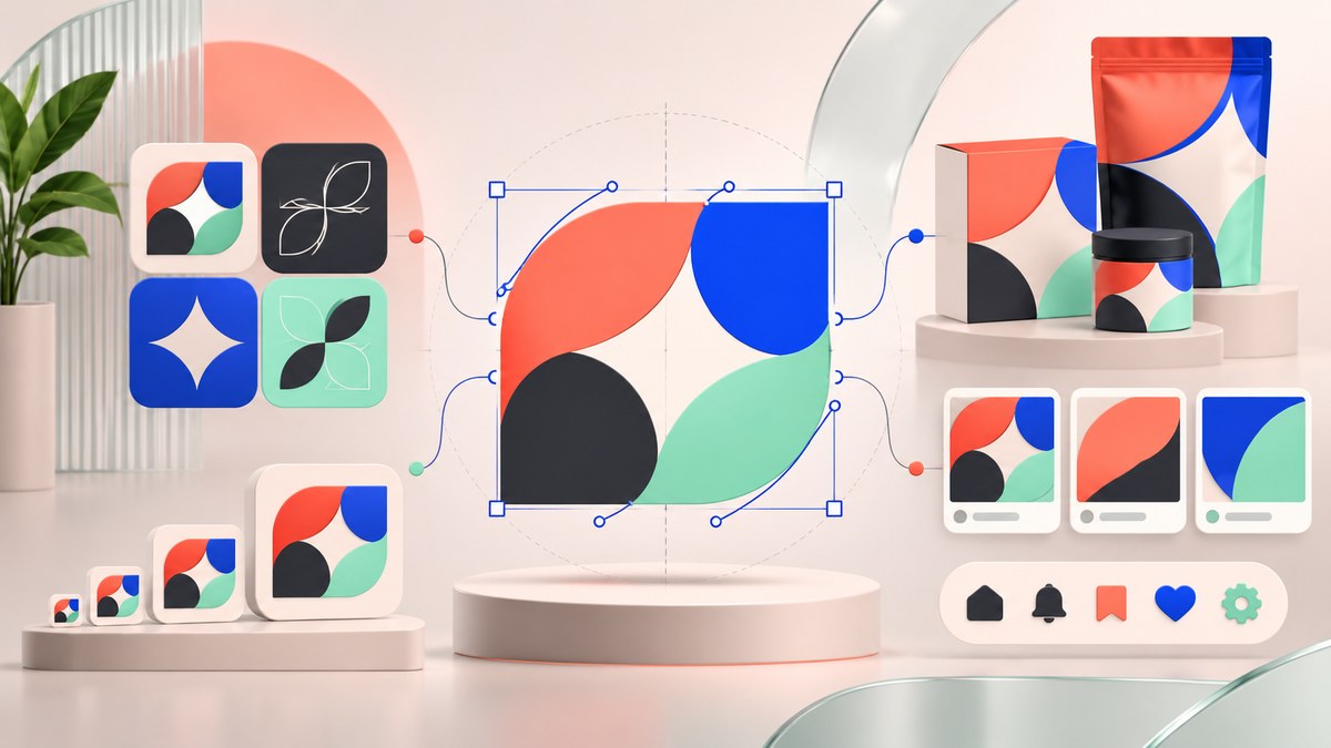
Your brand deserves to look the same everywhere. On a billboard, an Instagram story, a product label, and a website hero image. But getting that consistency right is harder than it sounds. Too many brands end up with a logo that looks crisp on a business card but fuzzy on a monitor. Or a color that shifts from screen to print. The fix is simpler than you think. Vector art. It is the single most reliable way to lock down brand assets so they behave the same way no matter where they appear.
Vector art uses mathematical paths instead of pixels. That means your logo, icons, and illustrations can scale to any size without losing sharpness. For brand consistency, this is a game changer. You build one master file and use it for everything from a tiny favicon to a 50 foot banner. No rework. No quality loss. No surprises.
Why Pixels Fail Your Brand
Raster images (JPEGs, PNGs, photos) are made of a fixed grid of pixels. When you stretch them beyond their original size, the pixels stretch too. You see jagged edges. Blurry details. A logo that looked sharp at 500 pixels wide turns into a mess at 5000 pixels wide.
This is the number one reason brand assets fall apart at scale. A marketing manager orders a banner for a trade show. The designer resizes the logo JPEG. It looks soft. They sharpen it. It looks worse. They give up and order a smaller banner. The brand suffers.
Vector art solves this at the file level. A vector logo is built with curves, anchor points, and fills. You can scale it to the size of a building and it stays razor sharp. That is why every serious brand guide demands vector source files.
What Makes Vector Art the Right Tool for Brand Consistency
Think of vector art as a set of instructions instead of a finished photograph. The file says “draw a circle with a radius of 2 inches, fill it with this exact hex code, stroke it with this weight.” Those instructions never change. The output changes based on the destination, but the math stays the same.
Here is what that means for your workflow:
- One source file for every output. You create the logo once as an SVG or AI file. From that file, you export a PNG for the web, a PDF for print, and an EPS for the sign shop. Every export comes from the same parent. No drift.
- Exact color control. Vector files store precise color values. You can set CMYK for print and RGB for digital inside the same document. No guessing. No converting on the fly.
- Smaller file sizes. A vector logo is often a few KB. A high resolution PNG of the same logo can be multiple MB. Smaller files load faster and are easier to share with your team.
- Editable forever. A vector file never flattens. You can open a logo you made five years ago and change the color, adjust the spacing, or swap a font. A raster file is a dead end.
The 3 Step Process for Building Consistent Brand Assets with Vector Art
If you are ready to lock in your brand assets, here is a repeatable process that works for teams of any size.
Step 1: Build a Master Vector File for Every Core Asset
Start with your logo. Open your vector software of choice (Adobe Illustrator, Affinity Designer, Inkscape, or Figma for UI work). Set your artboard to a clean square, like 1000 by 1000 pixels. Build your logo using paths, not placed images. Name every layer. Group elements logically. Save the file as a native vector format.
Do the same for your brand icons, illustration style, and any recurring graphic elements. If you use a specific pattern or texture, build it as a vector pattern swatch. If you have a signature illustration style, save a template file with your color palette and stroke settings locked in.
Step 2: Create an Export Map
You do not want to open the master file every time you need a PNG. Create a simple export map that tells you which format to use for which channel.
| Destination | File Format | Notes |
|---|---|---|
| Website header | SVG | Keeps sharpness, supports hover states |
| Social media posts | PNG at 2x resolution | Export from vector at 2x, compress for web |
| Business cards | Print ready PDF with bleeds | Use CMYK, embed fonts |
| Trade show banners | EPS or AI | Hand off to printer, include crop marks |
| Email signatures | Small PNG or base64 SVG | Keep under 50 KB |
Print out this map. Tape it to your monitor. It saves time and prevents format mistakes.
Step 3: Lock the Files with a Naming Convention
A consistent file name is just as important as a consistent design. Use a pattern like this:
brandname_logo_master.ai
brandname_logo_web.svg
brandname_logo_print.pdf
brandname_icon_arrow_master.ai
Store everything in one shared folder. Use a cloud drive so your whole team pulls from the same source. If you work with freelance designers, send them the master files, not exported PNGs. That way they stay inside your system.
Common Mistakes That Break Consistency
Even with vector art, things can go wrong. Here are the most frequent problems and how to avoid them.
| Mistake | Why It Happens | The Fix |
|---|---|---|
| Exporting at the wrong resolution | You forgot to change the export settings | Always export from the vector file at the exact size you need. Do not resize a PNG after export. |
| Using different color profiles | One file uses RGB, another uses CMYK | Set your master file to use both profiles. Or pick one and convert only at the final export step. |
| Editing a copy instead of the master | Someone made changes to a PNG and saved over it | Never edit an exported file. Always go back to the vector master, make the change, and re export. |
| Ignoring stroke alignment | Strokes set to “center” can look uneven at small sizes | Set strokes to “inside” or “outside” alignment. Test at the smallest size the asset will be used. |
A brand guide is only as good as the files it references. If your team is working from outdated raster exports, the guide does not matter. Keep the vector masters under version control. Every update starts from the same place.
When to Use Vector Art (and When Raster Is Fine)
Vector art is not the answer to everything. Photographs, complex textures, and painted effects are still raster territory. But for brand assets, vector should be your default.
Use vector for:
- Logos and lockups
- Icons and pictograms
- Illustrations with flat colors or gradients
- Typography (as outlines)
- Patterns and repeating elements
- Infographics and data visualizations
Use raster for:
- Photography and photo composites
- Complex textures and brush strokes
- Mockups that require realistic lighting
- Final exports for social media (but generate them from vector sources)
How to Sell This Workflow to Your Team or Client
If you manage a brand, you already know the pain of inconsistent assets. But your boss or client might not see the value of switching to a vector first workflow. Here is how to frame it.
- It saves money. One master file means no rework. No paying a designer to rebuild a logo every time you need a new size.
- It saves time. Your marketing team can export their own assets from the master files. They do not need to wait for a designer.
- It protects the brand. When every asset comes from the same source, the logo always looks right. The colors always match. The spacing never drifts.
Show them a side by side comparison. Take a logo JPEG and stretch it to 200 percent. Then take the vector version and do the same. The difference is obvious.
Building a Long Term System for Brand Asset Management
Once you have your vector masters in place, the real work is maintenance. Set a quarterly reminder to review your brand assets. Check that all files are still accessible. Update any that have changed. Archive old versions.
If you work with external agencies, include your vector master files in the brand guidelines you hand off. Do not just send a PDF of the logo. Send the SVG and the AI file. That way every agency you hire starts from the same place.
For a deeper look at how to structure your files and build a scalable system, check out our guide on building a scalable SVG workflow for branding and merch clients. It covers folder structure, file naming, and version control in more detail.
Your Brand Consistency Starts with One File
You do not need to overhaul your entire design process overnight. Pick one asset. Your logo is a good place to start. Open it in a vector editor. Clean up the paths. Name the layers. Save it as a master file. Then export a single SVG for your website and a single PDF for your business cards.
That one change will ripple through every piece of marketing you create from now on. No more fuzzy logos. No more color mismatches. No more last minute scrambles to resize something that should have been built right the first time.
Vector art is not a trend. It is the structural foundation of consistent brand design. Build on it once, and your brand will look right everywhere, every time. If you want to see how other designers are using vector art to push their work further, take a look at our showcase of innovative vector artists shaping the future of digital design. It is full of inspiration that will make you want to open your vector editor right now.