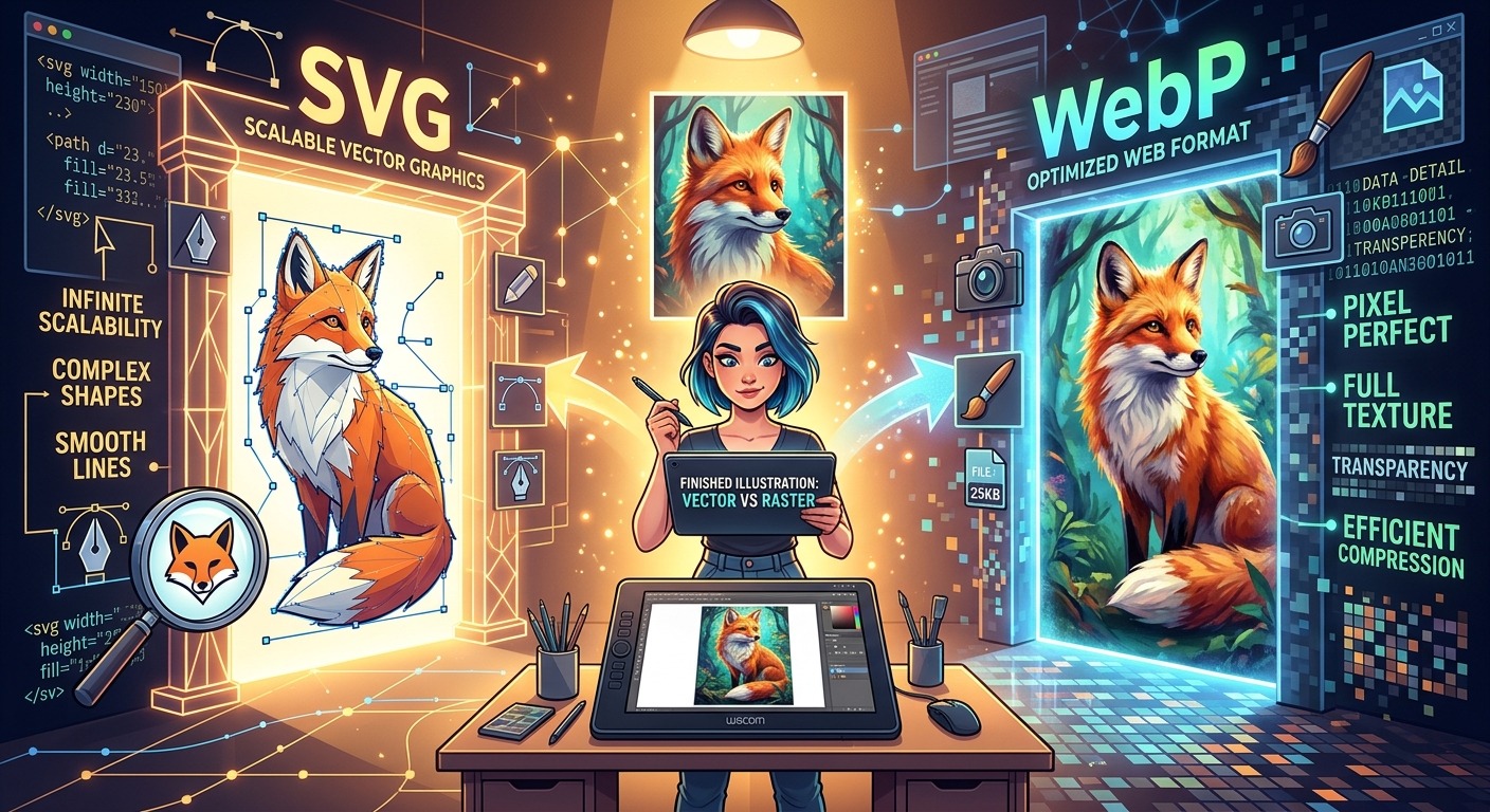
Your illustration looks perfect inside the vector editor. Then you upload it to a portfolio, and the soft shading looks rough. Or a detailed scene takes longer to load than expected. Finishing the drawing and preparing its delivery file are separate jobs. SVG preserves vector geometry. WebP delivers a fixed grid of pixels. Choosing between them starts with knowing what the finished image needs to do.
Three Decisions Before You Export
- Keep editable vector artwork as your production master.
- Use SVG when scalable geometry serves the final placement.
- Export WebP when fixed dimensions and measured file savings suit delivery.
Separate Your Working Artwork From Its Delivery Format
Think of your working file as a printmaking plate. It holds the structure you can return to, adjust, and reuse. A delivery image is an impression made for a particular surface. Sending that impression does not mean throwing away the plate.
Your master might be an Illustrator document, an Inkscape SVG, or another native project file. Keep whichever format preserves your actual workflow. That includes layers, live effects, editable lettering, linked assets, and color settings. An exported SVG may not retain every application-specific feature in an editable form.
A WebP export records the rendered appearance at chosen pixel dimensions. It does not preserve editable paths, Bézier handles, or live type. Converting that image back into vector artwork later requires reconstruction or tracing. Neither restores the original drawing decisions automatically.
This distinction helps with client handoffs. A client may need a flexible logo asset, a lightweight website illustration, and a store preview. Those are three uses with different requirements. One file does not have to carry all three.
Keep SVG When Geometry Does the Heavy Lifting
SVG describes graphics through elements that can include paths, shapes, text, and effects. Vector geometry can render at different sizes without being tied to one original pixel grid. That makes SVG a strong candidate for logos, icons, diagrams, and illustrations built from clean shapes.
A two-color symbol with a few dozen paths may remain crisp across a navigation bar, a presentation, and a large display. Rasterizing it introduces a resolution decision that the vector version did not require. The resulting WebP might also be larger than a carefully prepared SVG.
SVG can offer useful behavior inside websites. Depending on how it is embedded, its elements can support styling, interaction, and animation. Exporting a static WebP removes those element-level possibilities. If the illustration changes color with a theme or contains interactive regions, flattening it changes more than the file extension.
Keep realistic expectations about the contents, though. An SVG can contain embedded bitmap images. Those images still have resolution limits. Complex filters and application-specific exports also deserve testing in the browser where the artwork will appear.
Export WebP When the Finished Appearance Is the Product
A richly textured illustration often behaves differently from a simple brand mark. Thousands of paths, grain effects, masks, and translucent layers may produce a complicated SVG. If visitors only need to view the finished scene, delivering all that structure may offer little practical value.
WebP supports lossy and lossless compression, along with transparency. Lossy compression trades some image information for reduced file size. Lossless compression preserves the pixel values supplied to the encoder. Neither mode preserves the original vector geometry.
That makes WebP worth testing for portfolio thumbnails, editorial spot art, product previews, and static website illustrations. A rendered export can also make a complicated appearance more predictable because the browser receives the finished pixels instead of reconstructing every effect.
There is no guaranteed size advantage. A sparse SVG may be extremely compact. A detailed raster export may become heavy at large dimensions. Compare actual files at their intended display sizes before deciding which version belongs on the page.
How Each Format Fits Finished Illustration Work
| Delivery Need | SVG | WebP |
|---|---|---|
| Simple logo or icon | Often compact and scalable. | Useful when a raster asset is required. |
| Dense texture and shading | Complexity can increase file size and rendering work. | Worth testing for a compact static rendering. |
| Large or unpredictable display sizes | Vector elements scale without a fixed source resolution. | Requires enough pixels for the largest intended placement. |
| Transparent illustration overlay | Supports transparent areas and vector edges. | Supports transparency with rasterized edges. |
| Future editing | Can retain editable vector structure. | Contains rendered pixels rather than editable paths. |
Choose Pixel Dimensions Before Compression Settings
The most useful export setting is often width. A 3,000-pixel image can waste bandwidth inside a small project card, regardless of how carefully you adjust compression. Start with the placement, then calculate the pixels it needs.
For example, an illustration displayed at 600 CSS pixels wide may benefit from a 1,200-pixel export on a screen with a device pixel ratio of two. That is a starting point, not a universal requirement. Fine linework, expected zooming, and the surrounding page all affect the result.
Create separate sizes when the website supports responsive image delivery. A small mobile placement should not automatically receive the same file as a wide desktop hero. Keep the aspect ratio consistent unless you deliberately create different crops.
For web delivery, pixel dimensions control the available image detail. Changing a resolution metadata field from 72 to 300 pixels per inch does not add pixels. Check the actual width and height instead.
Prepare the SVG Before Rasterizing It
Inspect the artboard or page bounds first. Extra space around the drawing becomes extra space in the raster export. Shadows and glows can also extend beyond the visible shapes, so leave enough room to prevent clipping.
Check fonts next. A converter may render text differently if the required font is unavailable. For a delivery copy, converting lettering to paths can preserve its shape. Keep live text in the master so future edits remain manageable.
Review linked images and effects in the exported SVG itself. Open it outside the drawing application when possible. Missing assets, altered masks, or unsupported effects should be resolved before you judge WebP compression.
Once the SVG renders correctly, an SVG to WebP converter can provide a browser-based route to a raster delivery file. Check the available export controls and inspect the downloaded result. Do not assume every conversion tool handles fonts, filters, dimensions, or transparency in the same way.
Judge Compression Against the Drawing’s Weak Spots
Different illustration styles expose different problems. Flat fills make edge damage easy to spot. Soft gradients can reveal banding. Fine grain may turn muddy. Small lettering can lose clarity before the rest of the image looks noticeably different.
Compare lossless WebP with a few lossy exports when your tool supports both. Quality numbers are encoder settings, not universal promises. A setting that works for a painterly scene may damage a crisp geometric composition.
Inspect each candidate at its intended display size. Then zoom in to locate artifacts. High magnification helps diagnose a problem, but it should not become the only standard for approval. Your audience will usually encounter the artwork inside a real layout.
Pay particular attention to saturated edges, narrow strokes, and tiny reversed lettering. Lossy compression can affect color detail around sharp boundaries. If those details carry the design, a larger file or a different format may be the better choice.
Test Transparency Against Real Backgrounds
A transparent preview on a checkerboard can hide problems. Place the export against white, a dark neutral, and the actual destination color. Look for pale fringes, dark outlines, or rough transitions around soft edges.
These defects may come from the rasterization stage, an earlier matte color, or compression. Raising quality cannot reliably repair an edge that was already rendered against the wrong background. Return to the export setup when the problem appears in every version.
Thin vector strokes also need attention. Once rasterized, their appearance depends on pixel coverage and alignment. A stroke that feels balanced at one size may fade at another. Adjusting the delivery artwork can help, but preserve the original proportions in your master.
Match the Deliverable to the Commercial Use
For branding, keep scalable assets available for approved uses. A WebP logo preview can serve a website placement, but a vendor may need vector geometry for cutting, engraving, or large-format production. Confirm the required production format before handing over files.
For merchandise, distinguish the store mockup from the print asset. WebP may work well for a product listing image. The printer may require a different format, resolution, transparency setup, or color workflow. Prepare those files from the master rather than recycling the compressed preview.
For digital collectibles, check the destination’s accepted formats and display behavior. A WebP preview does not establish that every marketplace or viewer will accept the same asset. Keep an archival master and verify the actual upload requirements.
Client delivery becomes easier when filenames state purpose and dimensions. A name such as forest-scene-web-1200.webp communicates more than final-final-3.webp. Include a brief handoff note explaining which file belongs in which placement.
Keep the Curves, Ship the Right Pixels
SVG and WebP serve different stages of finished illustration work. Keep SVG when scalable geometry, compact shapes, or element-level behavior support the placement. Test WebP when a fixed rendering gives you the appearance and delivery size you need.
The strongest workflow leaves room for both. Preserve the editable artwork. Export for a known destination. Compare file size, edge quality, transparency, and rendering before publishing. Your curves remain ready for the next revision, while your audience receives an image prepared for the screen in front of them.